
Items filtered by date: December 2015
Our Partners
This is an excellent showcase for affiliations or memberships of relevant organisations. The icons are animated when they are hovered over. I based this on a module from the JSN Dona template.
Our partners






CSS
/*--- Our Partners ---*/

.our-partners {
	background: #F0F2F3;	/* Optional */
	padding: 10px;			/* Optional */
}

.our-partners h3 {
	font-size: 18px;
	line-height: 26px;
	text-transform: uppercase;
	font-weight: 700;
	margin: 30px 0px 30px 0px;
}

.our-partners .op-content {
  background: #fff;
  padding: 34px 30px;
  /*min-height: 250px;*/ /* Give the content a minumum height when needed */
}

.our-partners .op-content:before,
.our-partners .op-content:after,
.our-partners .op-content ul:before,
.our-partners .op-content ul:after {
	content: "";
	display: table;
}

.our-partners .op-content:after,
.our-partners .op-content ul:after  {
	clear: both;
}

.our-partners ul {
	margin: -30px -15px; /* this compensates for the <li> margins */
}

.our-partners ul li {
	float: left;
	list-style: none;
	margin: 30px 0 0;
	padding: 0 15px;
	width: 29%;
	height: 80px;
	line-height: 80px;
	text-align: center;
}

.our-partners ul li img {
	transition: all 0.5s ease-in-out;
	-o-transition: all 0.5s ease-in-out;
	-moz-transition: all 0.5s ease-in-out;
	-webkit-transition: all 0.5s ease-in-out;
}

.our-partners ul li img:hover {
	transform: scale(1.2);
	-o-transform: scale(1.2);
	-moz-transform: scale(1.2);
	-webkit-transform: scale(1.2);
}

@media screen and (max-width: 480px) {
	.our-partners .op-content {
		min-height: 1px;
	}
	.our-partners ul li {
	  width: 50%;
	}
}
HTML
<div class="our-partners">

	<h3>Our partners</h3>

	<div class="op-content">
		<ul>
			<li><img src="/images/modules/793/logo1.png" alt="" /></li>
			<li><img src="/images/modules/793/logo2.png" alt="" /></li>
			<li><img src="/images/modules/793/logo3.png" alt="" /></li>
			<li><img src="/images/modules/793/logo4.png" alt="" /></li>
			<li><img src="/images/modules/793/logo5.png" alt="" /></li>
			<li><img src="/images/modules/793/logo6.png" alt="" /></li>
		</ul>
	</div>

</div>
Happy Customers
This is a bootstrap driven Testimonial Carousel. It is responsivee and lightweight. It is easily styled and can be put in any module position. I based this on the testimonial module from the JSN Dona Template.
Happy Customers
This is just a big thank you to a great company with great products and even better customer service. These guys are really awesome. Using their templates and extensions, my site is loading faster than ever.

I absolutely LOVE JSN Epic PRO. All the functions I will ever need. No glitches, No hassles, No problems, and the best support team I have yet to encounter. Thanks for the only template I will ever need. Can"t praise them enough - Excellent.

I was looking for a suitable template which you can use it for multi languages website, especially it works with right to left language. I tried numerous other Joomla templates, but none were as flexible and efficient as joomlashine templates. Do not hesitate in buying joomlashine templates.

CSS
/*--- Happy Customers ---*/

.happy-customers {
	min-width: 200px;
	padding: 0px 20px;
}

/* - Title - */

.happy-customers h3 {
	font-size: 18px;
	line-height: 26px;
	text-transform: uppercase;
	font-weight: 700;
	margin: 30px 0px 30px 0px;
}

/* - Carousel Main Block - */

.happy-customers .hc-testimonial {
	-webkit-transition: none !important;
	transition: none !important;
}

/* - Carousel Items Wrapper - */

.happy-customers .hc-testimonial .carousel-inner {
	padding-bottom: 10px;
}

/* - Carousel Item - */

.happy-customers .hc-item {
	text-align: center;
	right: auto;
}

/* - Speech Bubble Container - */

.happy-customers .hc-item .hc-box {
	position: relative;
	background: #FFF;
	border: 1px solid #DDD;
	padding: 30px 15px 15px;
	border-radius: 5px;
	min-height: 250px; /* Keeps everything level */
}

/* - Speech Bubble Arrow on the bottom of the bubble - */

.happy-customers .hc-item .hc-box.top > .arrow {
	left: 50%;
	margin-left: -9px;
	border-bottom-width: 0;
	border-top-color: #999;
	border-top-color: rgba(0, 0, 0, .25);
	bottom: -10px;
}

.happy-customers .hc-item .hc-box .arrow {
	border-width: 9px;
}

.happy-customers .hc-item .hc-box .arrow,
.happy-customers .hc-item .hc-box .arrow:after {
	position: absolute;
	display: block;
	width: 0;
	height: 0;
	border-color: transparent;
	border-style: solid;
}

.happy-customers .hc-item .hc-box.top > .arrow:after {
	content: " ";
	bottom: -7px;
	margin-left: -9px;
	border-bottom-width: 0;
	border-top-color: #FFF;
}

.happy-customers .hc-item .hc-box.top > .arrow:after {
	border-width: 9px;
	content: "";
}

/* - Speech Bubble Content - */

.happy-customers .hc-item .hc-box .hc-content p {
	text-align: center;
	font-family: "Raleway";
	line-height: 24px;
	font-size: 15px;
	font-style: italic;
	color: #555;
}

/* - Avatar - */

.happy-customers .hc-item .hc-avatar {
	width: 60px;
	height: 60px;
	margin: 30px 15px 0 0;
	float: left;
}

.happy-customers .hc-item .hc-avatar img {
	display: block;
	width: 100%;
}

/* - Meta Information - */

.happy-customers .hc-item .hc-meta {
	margin: 30px 0 0;
	text-align: left;
	padding-right: 40px;
	overflow: hidden;
}

.happy-customers .hc-item .hc-meta span {
	font-weight: 700;
}

.happy-customers .hc-item .hc-meta span:before {
	/*content:'-';*/
	padding: 0 4px;
}

.happy-customers .hc-item .hc-meta span:nth-child(2):before {
	display: none;
}

.happy-customers .hc-item .hc-meta .hc-name {
	margin-bottom: 5px;
	font-size: 16px;
	color: #333333;
	font-weight: bold;
	display: block;
}

.happy-customers .hc-item .hc-meta .hc-jobtitle,
.happy-customers .hc-item .hc-meta .hc-country,
.happy-customers .hc-item .hc-meta .hc-link {
	display: inline-block;
	font-size: 12px;
	padding: 0 0;
	line-height: 20px;
}

.happy-customers .hc-item .hc-meta .hc-jobtitle,
.happy-customers .hc-item .hc-meta .hc-country {
	color: #8A8A8A;
}

/* - Navigation - Indicators */

.happy-customers .hc-testimonial .carousel-indicators {
	width: auto;
	display: inline-block;
	margin: 0;
	right: 0;
	left: auto;
	top: auto !important;
	bottom: -20px !important;
}

.happy-customers .hc-testimonial .carousel-indicators li {
	background-color: #cbcbcb;
	width: 8px;
	height: 8px;
	border: none;
	margin: 0 0 0 5px;
}

.happy-customers .hc-testimonial .carousel-indicators li.active {
	background-color: #0088CC;
}

/* - Navigation - Arrows arrows (Not Coded in HTML yet) */

.happy-customers .hc-testimonial .hc-arrow-left,
.happy-customers .hc-testimonial .hc-arrow-right {
	border: 1px solid #CCC;
	top: auto !important;
	bottom: -10px !important;
	position: absolute !important;
	display: inline-block !important;
	margin-top: -19px;
	font-size: 15px !important;
	color: #AAA !important;
	width: 25px !important;
	height: 25px;
	line-height: 24px;
	text-shadow: none !important;
	border-radius: 3px;
	-webkit-border-radius: 3px;
	-moz-border-radius: 3px;
}

.happy-customers .hc-testimonial .hc-arrow-left {
	left: 50% !important;
	margin-left: -28px;
	margin-bottom: 0;
	cursor: pointer;
}

.happy-customers .hc-testimonial .hc-arrow-right {
	right: 50% !important;
	margin-right: -28px;
	cursor: pointer;
}

.happy-customers .hc-testimonial .hc-arrow-left:hover,
.happy-customers .hc-testimonial .hc-arrow-right:hover {
	color: #428BCA !important;
	border-color: #428BCA;
}

/* - Navigation - Not sure */

.happy-customers .hc-testimonial .carousel-control.left {
	background-image: linear-gradient(to right, rgba(0, 0, 0, 0.5) 0%, transparent 100%) !important;
	background-repeat: repeat-x;
}

.happy-customers .hc-testimonial .carousel-control.right {
	background-image: linear-gradient(to left, rgba(0, 0, 0, 0.5) 0%, transparent 100%) !important;
	background-repeat: repeat-x;
}
JS Dependancies
JS
(function($){
	$(document).ready(function(){
		if($("#hc-carousel").length){

			/* if you do not have this block when using in joomla it breaks - dont know why */
			$('#hc-carousel').each(function(index, element) {
				$(this)[index].slide = null;
			});

			// Activate Carousel
			$("#hc-carousel").carousel({
			  interval: 5000
			});

			// Enable Carousel Indicators
			$("#hc-carousel .carousel-indicators li").each(function(i){
				$(this).on("click", function(){
					$("#hc-carousel").carousel(i);
				});

			// Add Enable Arrows here
			// ----------------------

			});
		}
	});
})(jQuery);
HTML
<div class="happy-customers">

	<h3>Happy Customers</h3>

	<div class="carousel slide hc-testimonial" style="width:100%" id="hc-carousel">

		<div class="carousel-inner">

			<div class="item active">
				<div class="hc-item">
					<div class="hc-box top">
						<div class="arrow"></div>
						<div class="hc-content">
							<p>This is just a big thank you to a great company with great products and even better customer service. These guys are really awesome. Using their templates and extensions, my site is loading faster than ever. </p>
						</div>
					</div>
					<div class="hc-avatar"><img src="/images/kb/2016/792/administrator.png" /></div>
					<div class="hc-meta">
						<span class="hc-name">John Doe</span>
						<span class="hc-jobtitle">System Administrator, </span>
						<span class="hc-country">United Kingdom</span>
						<span class="hc-company"><a href="http://quantumwarp.com/" target="_blank">QuantumWarp</a></span>
					</div>
				</div>
			</div>

			<div class="item">
				<div class="hc-item">
					<div class="hc-box top">
						<div class="arrow"></div>
						<div class="hc-content">
							<p>I absolutely LOVE JSN Epic PRO. All the functions I will ever need. No glitches, No hassles, No problems, and the best support team I have yet to encounter. Thanks for the only template I will ever need. Can"t praise them enough - Excellent.</p>
						</div>
					</div>
					<div class="hc-avatar"><img src="/images/kb/2016/792/administrator_female.png" /></div>
					<div class="hc-meta">
						<span class="hc-name">Jane Doe</span>
						<span class="hc-jobtitle">System Administrator, </span>
						<span class="hc-country">United Kingdom</span>
						<span class="hc-company"><a href="http://quantumwarp.com/" target="_blank">QuantumWarp</a></span>
					</div>
				</div>
			</div>

			<div class="item">
				<div class="hc-item">
					<div class="hc-box top">
						<div class="arrow"></div>
						<div class="hc-content">
							<p>I was looking for a suitable template which you can use it for multi languages website, especially it works with right to left language. I tried numerous other Joomla templates, but none were as flexible and efficient as joomlashine templates. Do not hesitate in buying joomlashine templates.</p>
						</div>
					</div>
					<div class="hc-avatar"><img src="/images/kb/2016/792/salesman.png" /></div>
					<div class="hc-meta">
						<span class="hc-name">James Doe</span>
						<span class="hc-jobtitle">Programmer, </span>
						<span class="hc-country">United Kingdom</span>
						<span class="hc-company"><a href="http://quantumwarp.com/" target="_blank">QuantumWarp</a></span>
					</div>
				</div>
			</div>

		</div>

		<ol class="carousel-indicators">
			<li class="active"></li>
			<li></li>
			<li></li>
		</ol>

	</div>

</div>
Find Us
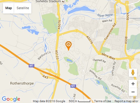
This is a Google Map and Contact Block that can be added to your homepage. It is fully responsive and is a great filler.
Find Us
-
Address: 198 Example street, Suite 7s new York, NY 10013
-
Phone: 112 345 6798
-
Email: example@email.com
CSS
/*--- Find Us ---*/

.find-us {
	background: #fff;
	padding: 20px;
}

.find-us .map-wrapper {
	display: inline-block;
	width: 45%;
	border: 1px solid #e5e5e5;
	padding: 10px;
	background: #fff;
}

.find-us .info-wrapper {
	display: inline-block;
	width: 45%;
	padding: 10px;
	vertical-align: top;
}

.find-us h2 {
	font-size: 33px;
}

.find-us .fu-list {
	margin: 30px 0 0;
}

.find-us .fu-list li {
	clear: both;
	margin: 15px 0 0;
	padding-bottom: 0;
	list-style-type: none;
	list-style-position: outside;
}

.find-us .fu-icon-wrapper {
	width: 20px;
	height: auto;
	line-height: 24px;
	margin: 1px 10px 0 0;
	z-index: 9;
	text-align: center; /* evens all the icons up */
	float: left;
}

.find-us .fu-icon-wrapper i[class*="fa"] {
	font-size: 18px;
	display: block !important; /* template_pro.css line 653 disables/sets this to none */
	color: #000;
}

.find-us .fu-content {
	overflow: hidden; /* this prevents the text flowing under the icon */
}

.find-us .fu-content p {
	padding: 0;
	margin: 0;
}

@media screen and (max-width: 768px) {
	.find-us .map-wrapper {
		width: 100%;
	}

	.find-us .info-wrapper {
		width: 100%;
	}
}
HTML
<div class="find-us">
<div class="map-wrapper">{load--module mod_bt_googlemaps,Us On The Map - Find Us}</div>
<div class="info-wrapper">
<h2>Find Us</h2>
<ul class="fu-list">
<li>
<div class="fu-icon-wrapper"><i class="fa fa-map-marker"></i></div>
<div class="fu-content"><p>Address: 198 Example street, Suite 7s new York, NY 10013</p></div>
</li>
<li>
<div class="fu-icon-wrapper"><i class="fa fa-mobile"></i></div>
<div class="fu-content"><p>Phone: 112 345 6798</p></div>
</li>
<li>
<div class="fu-icon-wrapper"><i class="fa fa-envelope"></i></div>
<div class="fu-content"><p>Email: <a href="mailto:example@email.com">example@email.com</a></p></div>
</li>
</ul>
</div>
</div>
<div style="clear: both;"> </div>
Notes
- This is based on a module from JSN Dona Template
- remove the -- from load--module to correct the code
Google Map
- You need to install and use a google map plugin. I have used the BT Google Maps plugin.
- Yes I have used an image in the demo because I did not want to install a plugin for 1 wiki article.
Adding the Google Map via a plugin
Option 1
- remember that the module must be published on the page you want to load it on.
- you should not assign a module position
- so you are best to copy the Us on the Map Module to use for the hompage only call it (copy it when you have finished the module)
- dont forget to enable parse content
- loadmodule does not like () in the module name
- you can use the new joomla module button, but it will only load in articles
Option 2
- you can remove the .map-wrapper and just load the map in an appropriate mopdule posistion instead
Option 3
- Manually add google map code within .map-wrapper, this might get removed when saving via a WYSIWYG
Contact Bar
This is a 100% width and then some horizontal bar that will allow you to break up a website page and promote a message or product. Change the background to match your needs. This was based on a design from the JSN Dona template and was published in the content-top-below position.
CSS
/*--- Contact Bar ---*/

/* -- FULL WIDTH Class (Optional)-- */
/* This class is inbuilt to the Joomlashine Dona Template, maybe others. Add the code below if not present */
.template-full-width {
	-webkit-box-sizing: content-box;
	-moz-box-sizing: content-box;
	box-sizing: content-box !important;
	width: 100%;
	padding-left: 1000px !important;
	padding-right: 1000px !important;
	margin: 0 -1000px !important;
	padding-top: 10px;
	padding-bottom: 10px;
	position: relative;
	-webkit-box-sizing: border-box;
	-moz-box-sizing: border-box;
	box-sizing: border-box;
}
/* ---- */

/* remove the extra padding in this module position only (optional) */
#jsn-pos-content-top-below  {
	padding: 0 0;
}

.contact-bar {
	background-image: url("images/modules/790/cb-background.jpg");
	background-position: center center;
	background-size: 100% 100%;
	background-attachment: fixed;
	padding: 25px 10px;
	text-align: center;
}

.contact-bar .cb-text {
	display: inline-block;
	width: 66%;
}

.contact-bar .cb-text p {
	font-size: 20px;
	line-height: 28px;
	color: #fff;
	text-align: right;
	margin: 15px 0 0;

}

.contact-bar .cb-button{
	display: inline-block;
	white-space: nowrap;
	margin: 15px;
}

.contact-bar .cb-button a.btn {
  color: #fff;
  font-size: 16px;
  line-height: 24px;
  font-weight: 600;
  text-transform: uppercase;
  letter-spacing: 2px;
  margin-top: 10px;
  padding: 13px 25px;
  text-decoration: none;
  text-shadow: none;
  box-shadow: none;
  border-radius: 3px;
  -moz-border-radius: 3px;
  -webkit-border-radius: 3px;
  transition: 0.3s;
  -moz-transition: 0.3s;
  -webkit-transition: 0.3s;
  width: auto;
  border-color: #9B1612;
  background: #9B1612;
}

.contact-bar .cb-button a.btn:hover {
	background: none;
	color: #9B1612;
}


@media screen and (max-width: 1024px){
	.contact-bar .cb-text p {
	  font-size: 16px;
	}
}

@media screen and (max-width: 799px) {
	.contact-bar .cb-text p {
	  font-size: 14px;
	  line-height: 22px;
	  margin: 10px;
	}
}

@media screen and (max-width: 768px) {
	.contact-bar .cb-text p {
	  text-align: center;
	}
}

@media screen and (max-width: 640px) {

	.contact-bar .cb-text p {
	  font-size: 16px;
	  line-height: 24px;
	  margin: 10px;
	}
	.contact-bar .cb-button {
	  padding-left: 0;
	}
	.contact-bar .cb-button a.btn {
	  margin: 0;
	}
}
CSS (Fix for this template to get the demo running)
.contact-bar .cb-button a.btn {
	color: #fff !important;
}
.contact-bar .cb-button a.btn:hover {
	color: #9B1612 important;
}
HTML
<div class="contact-bar template-full-width">
	<div class="cb-text"><p>NEED ADVICE on your business growth, customer experience or your finances?</p></div>
	<div class="cb-button"><a href="#" class="btn">Contact Now</a></div>
</div>
Header Canopy
You should see a canopy on top of this page. This is a great little item. You can add a canopy onto the top of your website which adds some atmosphere to it. This is specific to a joomlashine template but can easily be changed to any site.
CSS
/*-- Header Canopy --*/

/* Set Header Size - also corrects for mobile*/
#jsn-header {
	padding-top: 140px;
}
@media only screen and (max-width: 480px), (max-device-width: 480px) {
	#jsn-header {
		padding-top: 60px;
	}
}

/* Background Image */
#jsn-page {
	background-image: url(/images/kb/2016/789/canopy.png);
}

#jsn-page {
	background-size: 100% auto;
	background-repeat: no-repeat;
}

/* This stops the canopy from ever expanding (optional) */
@media only screen and (min-width: 1170px) {
	#jsn-page {
		background-size: 1170px;
		background-position: top;
	}
}
Notes
- From the JSN Gruve Template
- There are different coloured canopy graphics with this template that you can use. I think there is also the source PSD so you can modify it yourself.
- You do not have to use this graphic. You can use anything you want.
- Depending on the type of the tempalte you have the canopy might keep stretching
- The canopy is rigged to stop expanding at 1170px but you can remove the rule for this and then it will keep expanding i.e. 100%
Hamburger Hover
This module no longer has any hamburgers in it but I thought it was a cool name. This package is based on a layout from the JSN Gruve template. It is great for making points stand out more with some animated graphics.

Need cool template?
JSN Gruve is an amazing Joomla template with stunning visual design. Equipped with powerful features this template allows...
Easy to Start
JSN Gruve provides unique mechanism of installing sample data on directly your current website. Just few clicks and the demo...
Care about support?
Compared to big guys, we produce very little amount of templates, but with fanatical focus on quality of both product and support.CSS
/*-- Hambuger Hover --*/

.hamburger-hover {
	padding: 15px 0;
}

.hamburger-hover-description {
	overflow: hidden;
}

.hamburger-hover img.animation {
	-webkit-transition: all .3s linear;
	-moz-transition: all .3s linear;
	-ms-transition: all .3s linear;
	-o-transition: all .3s linear;
	transition: all .3s linear;
}

/* Sets an intial background colour to shine through the transparent Png */
.hamburger-hover img {
	background-color: #a2a2a2;
	margin: 10px;
}

/* The hover colours for the transparent icons */
.jsn-color-red .hamburger-hover:hover img {
	background-color: #bf0000;
}

.jsn-color-green .hamburger-hover:hover img {
	background-color: #63750F;
}

.jsn-color-blue .hamburger-hover:hover img {
	background-color: #389ED1;
}

.jsn-color-violet .hamburger-hover:hover img {
	background-color: #AB3C60;
}

.jsn-color-orange .hamburger-hover:hover img {
	background-color: #D18903;
}

.jsn-color-cyan .hamburger-hover:hover img {
	background-color: #268A76;
}
HTML
<!-- Module 1: Doves -->
<div class="hamburger-hover">
	<img src="/images/modules/788/Doves.png" alt="" class="animation" style="float: left;" />
	<div class="hamburger-hover-description">
		<h3 class="jsn-moduletitle"><span class="jsn-moduleicon"><a href="http://quantumwarp.com/">Need cool template?</a></span></h3>
		JSN Gruve is an amazing Joomla template with stunning visual design. Equipped with powerful features this template allows...
	</div>
</div>

<!-- Module 2: Party Dress -->
<div class="hamburger-hover">
	<img src="/images/modules/788/Party-Dress.png" alt="" class="animation" style="float: left;" />
	<div class="hamburger-hover-description">
		<h3 class="jsn-moduletitle"><span class="jsn-moduleicon"><a href="http://quantumwarp.com/">Easy to Start</a></span></h3>
		JSN Gruve provides unique mechanism of installing sample data on directly your current website. <a href="http://quantumwarp.com/" rel="nofollow">Just few clicks</a> and the demo...
	</div>
</div>

<!-- Module 3: Wedding Bells -->
<div class="hamburger-hover">
	<img src="/images/modules/788/Wedding-Bells.png" alt="" class="animation" style="float: left;" />
	<div class="hamburger-hover-description">
		<h3 class="jsn-moduletitle"><span class="jsn-moduleicon"><a href="http://quantumwarp.com/">Care about support?</a></span></h3>
		Compared to big guys, we produce very little amount of templates, but with fanatical focus on quality of both product and support.
	</div>
</div>
Notes
- utilises transparent png and a changing background colour - inbuilt to gruve but this is the code it depends on just incase it is used in another template
- you have to create the transparent icons
- This is from the JSN Gruve Template
- You must create seperate module for each HTML code block.
- They were original published in the content-top position but can go anywhere now.
- I would use the module names as noted above for the module names to keep things organised.
Great Experience
A nice 4 module arrangement that you can use to use for 'Call To Action' or promote specifi products.


Great Docs & Support
In addition to comprehensive documentations in PDF format, you also get support from friendly forum and dedicated support system.

Free Edition
In the case you are on tight budget or just want to taste this template before paying. We have free edition for you to download right now.

FRO Edition
If you are serious about your time and money, consider to buy PRO edition to get full featured template and dedicated support service.
HTML
<!-- Module 1: Easy To Start --> <p><img src="/images/modules/787/showcase.png" alt="showcase" class="img-showcase" style="position: relative; top: 25px; border: none;" /></p> <!-- Module 2: Great Docs & Support --> <div style="text-align: center;"><img src="/images/modules/787/like-icon.jpg" alt="like-icon" class="" style="margin: 30px 0;" /> <h3 class="jsn-moduletitle"><span class="jsn-moduleicon">Great Docs & Support</span></h3> <p style="padding: 10px 0;">In addition to comprehensive documentations in PDF format, you also get support from friendly forum and dedicated support system.</p> <p><a href="http://quantumwarp.com/" class="link-button button-green">Download docs</a></p> </div> <!-- Module 3: Free Edition --> <div style="text-align: center;"><img src="/images/modules/787/free-icon.jpg" alt="Free" class="" style="margin: 30px 0; border: none;" /> <h3 class="jsn-moduletitle"><span class="jsn-moduleicon">Free Edition</span></h3> <p style="padding: 10px 0;">In the case you are on tight budget or just want to taste this template before paying. We have free edition for you to download right now.</p> <p><a href="http://quantumwarp.com/" class="link-button button-green">Download Free</a></p> </div> <!-- Module 4: PRO Edition --> <div style="text-align: center;"><img src="/images/modules/787/pro-icon.jpg" alt="Pro" style="margin: 30px 0; border: none;" /> <h3 class="jsn-moduletitle"><span class="jsn-moduleicon">FRO Edition</span></h3> <p style="padding: 10px 0;">If you are serious about your time and money, consider to buy PRO edition to get full featured template and dedicated support service.</p> <p><a href="http://quantumwarp.com/" class="link-button button-green">Buy PRO edition</a></p> </div>
Notes
- This is from the JSN Gruve Template
- You must create seperate module for each HTML code block.
- They were original published in the content-bottom position but can go anywhere now.
- I would use the module names as noted above for the module names to keep things organised.
JSN-EasySlider
Prebuilt Slides
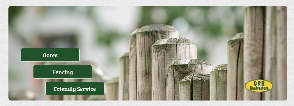
This slider is comprised of 2 slides using the same layout you can see above. Dont forget to chase the file loctions as needed. Download here.
General
/* EasySlider Backgroun Rounded Corners */
.jsn-es-background.slide-background {
	-webkit-border-radius: 10px;
	-moz-border-radius: 10px;
	border-radius: 10px;
}
/* Rounded Corners - Remove the coloured background */
#jsn-promo {
    background-color: transparent;
}
Notes
Copy Objects between layers (desktop, laptop, etc)
you can copy and paste between layers, sort of.
when you copy and paste, within a slide the process is not layer aware. What this means is that no matter what layer you are on the paste operation will place the copied object in the slide and it is the layer visibility that allows you to show the object on a specific layer. All objects are present on every layer they just might not be visibly.
so before copying an object, select visible on all layers and then paste. Edit the visibility as needed and you are done
Other notes
- If you only do the desktop version then the text slidy things automatically resize
Main-Slider Ideal Settings
When the desktop width is 1170px
default image locations and sizes
-
images/modules/main-easyslider/logo.png (122 x 56)
-
images/modules/main-easyslider/slide1-background.jpg (1280 x 720)
-
images/modules/main-easyslider/slide2-background.jpg (1280 x 720)
Add the other recommend sizes to keep ratio, perhaps look at that dark image article.
JSN-Reta
/* Remove gutter on easy slider / Promo Position */
    body:not(.jsn-demo-page) #jsn-promo #jsn-promo-inner {
    padding: 0px !important;
    width: 100%;
}
/* Background image for footer */
#jsn-footer::before {
    background: url("../custom/images/footer-background.jpg");
}
I made a dark image by using paint and changing the following settings.
- Brightness: -60
- Contrast: -60
/* Remove Logo and padding from footer information module */
.jsn-page-info {
    background: none;
    padding-top: 5px;
}
Contact Information
The Information blocks were adapted from JSN Reta
Header
 0800 123 4567
- 01772 123456
 07747 123456
 info@example.com
CSS
/*--- Header Contact Information ---*/

.header-contact-information:before,
.header-contact-information:after {
	content: "";
	display: table;
}

.header-contact-information:after {
	clear: both;
}

.header-ci-btn {
	font-size: 12px;
	line-height: 20px;
	color: #333 !important;
	text-transform: uppercase;
	font-weight: 500;
	padding: 10px 20px;
	border-radius: 3px;
	transition: 0.3s;
	-moz-transition: 0.3s;
	-webkit-transition: 0.3s;
	border: 1px solid #e5e5e5;
}

.header-contact-information .header-ci-btn:hover {
	opacity: .8;
}

.header-contact-information {
	margin-top: 30px;
	padding: 0 150px 0 20px;
	border-left: 1px solid #e5e5e5;
	position: relative;
}

.header-contact-information .jsn-left {
	font-size: 14px;
	line-height: 22px;
	margin: -8px 0 0;
}

.header-contact-information .jsn-left li {
	margin: 8px 0 0;
	list-style: none;
}

.header-contact-information .jsn-left li span {
	margin-right: 18px;
}

.header-contact-information .jsn-left li a {
	color: #363636;
}

.header-contact-information .jsn-left li a:hover {
	color: #b0c052;
}

.header-contact-information .header-ci-btn {
	position: absolute;
	top: 5px;
	right: 0;
}

body.jsn-direction-rtl .header-contact-information {
	padding: 0 20px 0 150px;
	border-right: 1px solid #e5e5e5;
	border-left: none;
}

body.jsn-direction-rtl .header-contact-information .header-ci-btn {
	top: 5px;
	left: 0;
	right: auto;
}
HTML
<div class="header-contact-information" style="width: 250px;">
	<ul class="jsn-left">
		<li><img src="/images/modules/784/header/fa-phone.png" alt="Call Us" /> 0800 123 4567</li>
		<li><img src="/images/modules/784/header/fa-phone.png" alt="Call Us" /> 01772 123456</li>
		<li><img src="/images/modules/784/header/fa-mobile-phone.png" alt="Call Us" /> 07747 123456</li>
		<li><img src="/images/modules/784/header/fa-envelope.png" alt="Call Us" /> <a href="mailto:info@example.com">info@example.com</a></li>
	</ul>
	<a href="http://quantumwarp.com/" class="header-ci-btn">contact us</a>
</div>
Footer

-
 Rocky Lane, Skerton, Manchester, Cumbria, MA1 1QW
 -
 0800 123 4567
 -
01772 123456
-
 07777 123 456

CSS
/*--- Footer Contact Information ---*/

.footer-contact-information {
	list-style: none;
	font-size: 14px;
	padding-top: 30px;
}

.footer-contact-information p,
.footer-contact-information a {
	color: #acacac;
}

.footer-contact-information li {
	margin: 12px 0 0;
	list-style: none;
}

.footer-contact-information li:first-child {
	margin-top: 0;
}

.footer-contact-information li img {
	float: left;
	margin-right: 15px;
}
HTML
<div class="footer-contact-information">

	<img src="/images/modules/784/footer/784/footer/logo.png" alt="QuantumWarp" />

	<ul class="clearfix">
		<li>
			<p><img src="/images/modules/784/footer/784/footer/fa-map-marker.png" alt="" /> Rocky Lane, Skerton, Manchester, Cumbria, MA1 1QW</p>
		</li>
		<li>
			<p><img src="/images/modules/784/footer/784/footer/fa-envelope.png" alt="" /> <a href="mailto:info@example.com">info@example.com</a></p>
		</li>
		<li>
			<p><img src="/images/modules/784/footer/784/footer/fa-phone.png" alt="Call Us" /> 0800 123 4567</p>
		</li>
		<li>
			<p><img src="/images/modules/784/footer/784/footer/fa-phone.png" alt="Call Us" /> 01772 123456</p>
		</li>
		<li>
			<p><img src="/images/modules/784/footer/784/footer/fa-mobile-phone.png" alt="Call Us" /> 07777 123 456</p>
		</li>
	</ul>

</div>
The colour for the icons and text = #acacac