Items filtered by date: December 2015
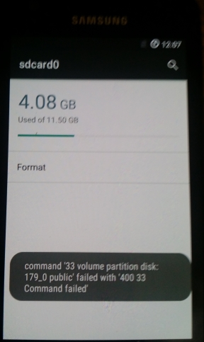
Cannot format Internal SD Card on Samsung S2 running Cyanogenmod CM13
You receive the following error when trying to format your Samsung S2 Internal SD drive in Cyanogenmod CM13 (Android 6.0.1):
Command ’33 volume partition disk:
179_0 public’ failed with ‘400 33
Command failed’
Possible Causes
- Corrupt PIT
- The kernel/Bootloader was not IsoRec compatible
- Corrupt partition format
- The ROM is faulty
Solution (does not work)
After I had updated the bootloader/Recovery with TWRP 3.0 and performed a REPIT The drive seems to work ok. This basic will fix any of the errors outlined above. Obviously unless you need to re-partition you Samsung I would just try updating the Bootloader/Kernel/Recovery first.
I still cannot reformat the drive in CM13
Notes
- https://forum.cyanogenmod.org/topic/124100-sd-card0-showing-as-corrupt-why/
- My problem has been resolved by starting afresh from a stock Rom and stepping up slowly. Therefore this topic is now closed.
- http://forum.xda-developers.com/galaxy-s2/help/sdcard0-corrupt-cm-13-0-20160304-t3332269
- could be a rom issue with 13 so i will now flash an older version, on guy said he went back to stock an built up slowly
- http://android.stackexchange.com/questions/48524/how-to-restore-damaged-internal-sd-card-partition-layout-tried-everything
- possibly requires to be flashed by odin to reflect a new PIT (partition layout)
- i dropped to cm-11-20150614-NIGHTLY-i9100 (last version 11) and then formatted the SD drive in android, this worked with no error. 12 might of worked.
- you cannot format whilst the usb cable is connected. CM v11 still has clockword mod by default.
- I have the usb cable connected when I tried wiping in cm13
- so i will now upgrade 11 --> 12 --> 13
This could just be a bug in the current revision of CM13.x so another excellent solution is to see if updating to the latest verion of CM13 works.
Slow Samsung Evo 850 SSD
These are my reseach notes for trying to find out why my new Samsung Evo 850 SSD was not running at advertised speeds in my Dell E6540 Laptop.
Settings I tried and the results:
- Chipset drivers set as IRRT but running in ACHI mode in bios (No Change)
- using a standard ahci drive from microsoft 2006 causing issues (No Change)
- use intel RST technology but make sure this is the driver being used (No Change)
- c state setting in bios (No Change)
- Disable the samsung RAPID Mode as it is only a RAM disk
- Intel speed step disabled (a bit better)
- Single core rather than multi (slower IOPS read if i restrict to 1 core because not proper 1 CPU emulation, 1 core giving half speed and thus maxing the core out.)
- UEFI / Legacy MBR (No Change)
Other Settings Not tried or are not applicable:
- I can bump those 4K random read/writes up by disabling C1e and c-states in my BIOS
- Other power settings in bios
So the Specific Settings I have available in my Dell E6540 are:
- System Status
- SATA Operation = AHCI
- Performance
- Multi Core Support
- Intel SpeedStep
- C-States Control
- Intial Turboboost
None of these made any difference.
Other things to try that have been suggested:
- Try safe mode
- Try running prime 59 whilst running the Performance program because the CPU is kicked in fully
- Window has power management features that could throttle the CPU
- See if the drive is faulty by trying it in a Desktop PC with a powerful SATA chipset.
Conclusion
It is my chipset that has a limitation. Not all laptops were designed to handle SSD speeds because when these laptops were getting designed, SSDs were not main stream yet.
Links
Flying Form
This code creates a form using a UniForm, that will slide in from the center for that extra effect to whichever module position you select In this case, Stick Leftbottom [stick-leftbottom] position.
This code is designed for Uniform but can be adapted to slide in any module.
CSS
/* Container */

.flying-form {
	padding-left: 10px;
}

.flying-form .popup-form {
	position: relative;
	margin-bottom: 50px;
	width: 320px;
	min-height: 142px;
}

/* Animation */

.flying-form .animated {
	-webkit-animation-duration: 1s;
	animation-duration: 1s;
	-webkit-animation-fill-mode: both;
	animation-fill-mode: both;
}

@-webkit-keyframes slideInRight {
	0% {
		-webkit-transform: translate3d(100%, 0, 0);
		transform: translate3d(100%, 0, 0);
		visibility: visible;
	}
	100% {
		-webkit-transform: translate3d(0, 0, 0);
		transform: translate3d(0, 0, 0);
	}
}

@keyframes slideInRight {
	0% {
		-webkit-transform: translate3d(100%, 0, 0);
		transform: translate3d(100%, 0, 0);
		visibility: visible;
	}
	100% {
		-webkit-transform: translate3d(0, 0, 0);
		transform: translate3d(0, 0, 0);
	}
}

.flying-form .slideInRight {
	-webkit-animation-name: slideInRight;
	animation-name: slideInRight;
}

/* Styling */

.flying-form .popup-form {
	position: relative;
	margin-bottom: 50px;
	width: 290px;
	background-color: #fff;
	padding: 15px 15px 0;
	box-shadow: 0 0 4px #666!important;
	border-radius: 3px 0 0 3px !important;
}

.flying-form .popup-form h2.popup-title {
	text-transform: none;
	margin: 10px 0 0 10px;
	font-size: 16px;
	line-height: 1.3;
	font-weight: bold;
}

.flying-form .popup-form .jsn-bootstrap .jsn-form-content .control-group {
	padding: 0 !important;
}

.flying-form .popup-form .jsn-form-content .control-group .control-label .required,
.jsn-uniform.jsn-master .popup-form .jsn-form-content .control-group .control-label i {
	display: none;
}

.flying-form .popup-form .jsn-form-content .control-group.ui-state-highlight {
	background-color: transparent !important;
	border-color: transparent !important;
}

.flying-form .popup-form .jsn-column-item.jsn-uniform-others textarea.jsn-value-Others {
	width: 255px !important;
	height: 20px;
}

.flying-form .popup-form .form-actions {
	padding: 0;
	padding-top: 10px;
	margin-top: 5px;
	margin-bottom: 5px;
	background: transparent;
}

.flying-form .popup-form .form-actions .btn-toolbar {
	margin-top: 0;
}

.flying-form .popup-form .form-actions .btn-toolbar .jsn-form-submit {
	width: 270px;
	background: #2baaff;
	border: none;
	box-shadow: none;
	text-shadow: none;
	margin-left: 0;
	/*margin: -20px 0 20px 10px;*/
	margin: 0px 0 20px 10px;
	padding: 10px 0;
	font-weight: bold;
}

/* Close Button */

.flying-form .popup-form .close-div {
	position: absolute;
	top: -10px;
	left: -10px;
	background-color: #222;
	border-radius: 50px;
	width: 20px;
	height: 20px;
	line-height: 20px;
	text-align: center;
}

.flying-form .popup-form .close-div i {
	color: #eee;
	margin: 0;
}

.flying-form a.close-div {
	display: none;
}

.flying-form:hover a.close-div {
	display: block;
}
JS Dependancies (Joomla / External / 3rd Party)
- Cookie Support = jquery.cookie.js - You can probably get a newer version of this from the usual sources, but you can click on the filename and download from it from this page. Also this library has been referenced in the HTML (Bottom Content) code below.
HTML (Top Content)
<!-- Top Content -->
<div class="popup-form animated slideInRight">
	<h2 class="popup-title">You expect the next QuantumWarp survey will be about:</h2>
The form will be rendered in-between these code blocks
HTML (Bottom Content)
<!-- Bottom Content -->
	<a href="#" class="close-div"><i class="fa fa-close"></i></a>
</div>

<script src="/images/kb/2016/814/jquery.cookie.js"></script>

<script>
	(function($) {
		$(document).ready(function() {
			//$.cookie('flying-form', '0');
			$(".close-div").click(function() {
				$.cookie('flying-form', '1');
				$(".popup-form").hide();
			});

			$(".flying-form .jsn-form-submit").click(function() {
				$.cookie('flying-form', '1');
				$(".flying-form .jsn-form-content").fadeOut('slow');
				$(".flying-form .form-actions").fadeOut('slow');
				sheet = document.styleSheets[0];
				sheet.insertRule(".flying-form .jsn-form-content, .flying-form .form-actions { display: none !important }", 1);
			});

			if ($.cookie('flying-form') != 1) {
				$(".flying-form").fadeIn('slow');
			}
		});
	})((window.JoomlaShine && JoomlaShine.jQuery) ? JoomlaShine.jQuery : jQuery);
</script>
Notes
- To configure Uniform for this Flying Form effect
- Add the CSS code to your custom.css file
- and the load the jquery.cookie.js into your modules folder (ie images/modules/814/)
- Create your form as a module, I called my Flying Form
- Add flying-form as a module suffix
- Disable the WYSIWYG in both the 'Top Content' and 'Bottom Content' boxes
- Paste the HTML (Top Content) in to the 'Top Content' box
- Paste the HTML (Bottom Content) in to the 'Bottom Content' box
- Select the Stick Leftbottom [stick-leftbottom] position (or selected position)
- Publish Module
- To make this code work for anymodule or to slide in other code
- create a Custom HTML module with flying-form module suffix
- Just combine the HTML snippets and paste this into the Custom HTML module
- Paste you new module content inbetween the HTML blocks
- publish to your select module position
- Save
- The close button uses Font Awesome in the HTML and some CSS styling.
<a href="#" class="close-div"><i class="fa fa-close"></i></a>
- The cookie storing of the user closing the slider does not seem to work. Code look correct though.
- Using radio selecter keeps the form short.
Phone Numbers in Topbar and centered in mobile
This is a great little snippet to add phone numbers into the topbar and when displayed in mobile are centered and on seperate lines so everything looks nice.
Tel: 0800 123 4567 Mobile: 07777 123 456
HTML
<p style="text-align: center;">
	<span style="font-size: 24pt;">
		<span style="display: inline-block; white-space: nowrap; margin-top: 5px;">Tel: 0800 123 4567</span>  <span style="display: inline-block; white-space: nowrap; padding-top: 5px;">Mobile: 07777 123 456</span>
	</span>
</p>
Dehacking a Joomla Website
These are my notes on recovering your hacked Joomla website (de-hack/dehack/dehacking).
The best prevention is to have good reliable backups.
Part 1 - Am I hacked?
If you receive reports from a customer that their website is hacked you need to look at their site from your computer.
Precautions
- Use a Sacrificial PC (a PC you dont mind wiping if it gets infected)
- Make sure A-V is running
- HIPS is on
- An AD Blocker is running
- Run your browser in Sandbox mode
- Malwarebytes Anti-Exploit is running
- Javascipt is disabled (to start with)
- Adobe PDF is not installed
- No Script Plugin is running
What should I do to check?
- Check the obvious cPanel settings to make sure it is not them causing a website to go off
- Is the account suspended
- Over bandwidth quota Account
- Over disk quota
- Have a look around with ftp / cPanel before anything else
- Are there random file names and unusual folders
- Check the CGI folder and remove anything in there (should I disable CGI)
- Check the Vulnerability Feed from Joomla
- Check the homepage to see if it is hacked (optional)
- Check .htaccess
- Login to Joomla admin
- Install RSFirewall and run system check
- Check Website log files
- check the raw access logs with ApacheLogViewer (or other log viewer) and check for access to dodgy files and heavy access from 1 IP etc..
- Also try sorting by request, this will expose dodgy files and their access
- POST should not be heavily used by remote IP address
- Add these IPs to the htaccess IP deny rules
Part 2 - First Steps if your site is hacked
- Disable website by .htaccess (Deny From All)
- Change cPanel password
Part 3 (opt A) - Recover from backup
This by far is the best way to recover your joomla website.
This will replace all files and your database, so if youor backup is really old or out of date you should consider if this is the best option for you.
- Back the virus infect website up and store
- Why do this? This is done just in case you have missed some new content or other thing you have missed. It does not harm and this backup can be deleted later. Download this to your PC before starting.
- Verify that the Joomla version of the infected website and the backup are the same. If they are not you will need replace the database with that out of the backup and this can lead to content loss if the backup is not new enough. If you do not want to swap the database you cannot use this method.
- The joomla version number is stored in
- administrator/manifests/files/joomla.xml
- /libraries/cms/version/version.php
- Write down the Joomla version make sure you combine the release+maintenance version to get the correct joomla version?
- How to find which version of Joomla! I'm using? - Joomla!
- The joomla version number is stored in
- Delete the files in public_html folder on the server
- Upload your backup
- Only the contents of the public_html folder, you should extract these files from the backup and re-zip ready for upload.
- You can also upload the full backup and after extraction only move the required files into public_html if you know what you are doing
- Extract backuped files into the public_html folder
- Replace the database (optional)
- only do this if the Joomla versions were not the same
- Empty joomla cache
The site should now be running but it might not be clean, backups can still have issues. Perform the Hack Cleanup to finish.
Part 3 (opt B) - Repair Hacked Site (as is)
If you do not have any backups you will need to repair your Joomla installation using the following procedure. This is not the preferred option.
- Backup the website
- Why do this? This is done just in case you have missed some new content or other thing you have missed. It does not harm and this backup can be deleted later. Download this to your PC before starting.
- Write down the Joomla version
- The joomla version number is stored in
- administrator/manifests/files/joomla.xml
- /libraries/cms/version/version.php
- Write down the Joomla version make sure you combine the release+maintenance version to get the correct joomla version?
- How to find which version of Joomla! I'm using? - Joomla!
- The joomla version number is stored in
Full Package Joomla System Files Re-Install
This section should re-enable Joomla but malware might be present in 3rd Party Apps and in random folders all over the place and should not be counted on as fully cleaning your website.
This section will also allow you to get a list of installed extensions and their version numbers. You can get these from your database if you know what you are doing.
- Download the full installation package for the same Joomla version from github
- extract the zip file
- upload all of the extracted Joomla files to the hacked website's public_html folder and replace all files
- This should allow you to get basic access to your joomla website
- login into the joomla website and get a list of the installed extensions and their version numbers
You can move to the 'Perfom Hack Cleanup' section if you have time contraints or are happy that the infection is not envasive, this is not recommended. You should carry on with the next section.
Full Fresh Install with 3rd Party Apps brought back in
This is a lot more thourough in cleaning you site but requires a lot more work. This assumes you have followed the section above and have a backup of the infected site and a list of extensions.
- Delete the files in public_html folder on the server
- Extract the backup you just made on to your PC (of the infected site)
- Scan the files in the public_html files for virus and remove them if found.
- Upload the Full Joomla installation package to the public_html folder on the server
- carefully check the /images/ folder and once you are happy that it is clean upload this to public_html on the server
- There might be 3rd party apps that have user files that need uploading (ie in the media folder), unless you know what needs uploading and have check for virus or dogy files DO NOT UPLOAD, you can always do this later. Most user stuff will be in the /images/ folder
- Download all of the extensions you need and make sure they are the correct version
- check the configuration.php from the download infected backup and make sure it is clean from virus or dodgy code and then if all clear upload it to the website server
- Login to joomla. You migth get some erros but ignore these unless you cannot login (that will need to be dealt seperately)
- install all of the extensions you have downloaded. this will re-install all of these extensions with fresh files.
- Check all of the extensions are working correctly (i.e. there are no missing images). If there are missing images check in your infected backup for them, clean the related files and folders and then upload them to the correct location on the server.
- Check joomla is running normally
The site should now be running but it might not clean yet. Perform the Hack Cleanup to finish.
Part 4 - Post Hack Cleanup
These instructions should be done for all versions of recovery and help prevent getting re-infected and remove any straggling malware or unwanted behaviour.
Users and Passwords
- Remove any erroneous user accounts. Delete any users that should not be in the Joomla user manager.
- Change passwords (and prefixes) for the following in order and all of them:
- cPanel (if not already)
- MySQL Database
- MySQL Database Prefix
- RSFirewall
- Joomla Users - Reset them all
- if you have users do a bulk reset once you have changed the admin password
- Edit configuration.php via cpanel and change MySQL database password
- Check the administrator folder is protected by .htaccess authentication (Batcode). If it isn't, add this feature
- Enable 2nd Factor Authentication in Joomla (I have not tried this yet)
- The potential login procedure would follow
- URL with Token
- Batcode
- RSFirewall
- Joomla Login
- 2nd Factor Authentication
RSFirewall
If already installed upgrade it if it is not the latest version.
- Install RSFirewall if not present (with hashes and GeoIP)
- Upload New Hashes (if not present)
- Install GeoIP to block by country? (if not present)
- Configure RSFirewall settings (as per skeleton notes)
- Upload Skeleton Config - Which includes:
- Block all China and Russia
- Active file scanner
- Enable admin password protection
- High and critical emails sent to joomla@example.com
- Disable Joomla Installer
- Prevent New Admins from being created
- convert all emails to images (i have not used this yet)
- Filter File Uploads
- Automatic Blacklisting set to 10
- etc...
- Upload Skeleton Config - Which includes:
- Scan / System check and follow all recommendations (apart from php.ini)
- Remove any malware files it finds by keeping the list on screen and then use a ftp browser and remove all infractions
- Temp Files
- Empty temp files (except index.html if doing manually)
- The temp folder should be /home/{account}/tmp-joomla if not already
- Don’tdelete /home/{account}/publid_html/tmp it will just come back with a system upgrade or get flagged by the RSFirewall as missing.
- Database Check (PHPMyAdmin and RSFirewall)
Upgrade Joomla and Extensions
Backup again before doing this sections for safety.
- Re-install/Upgrade all extensions
- Re-install/Upgrade template (Joomlashine allows you to scan files for modifications)
- Remove JSecure lite (if present)
- Install SH404SEF (optional)
- Upgrade Joomla
Joomla Settings
- Add captcha to all forms
- Empty joomla cache
- Add 5G firewall
Final Operations
- Empty Temp files again
- Run RSFirewall System check
- Create a backup from the live webserver and save it to your PC
- Extract the public_html (your could do the whole cPanel archive) and scan for virus
- If the scan(s) come back clear you are done. If any virus is found you need to remove them and upload the cleaned files
- remove any .htaccess restrictions
- Delete the root .htaccess and robots.txt files and replace with the Skeleton ones or use the latest Joomla ones from the upgrade
- Done
Part 5 - cPanel Additional
I use cPanel for hosting so this is what I do but you can easily translate these in to any other hosting platform
- Set email quotas within the disk quota of the account ie the website + email quota is below the account limit 100mb mail boxes is good.
- Purge the default mailbox (probably via webmail or ftp)
- load horde, right click on the inbox and select empty - this will remove all emails
- Set Default Email address to "Discard the email while your server processes it by SMTP time with an error message."
- Country restrict the site via .htaccess (in the short term)
- Enable SPF and DKIM
- Get the server PHP version upgraded if needed
- Server AV scan when replacing the .htaccess you must bear in mind multiple domains , if you delte these rewrites this could cause a connection reset error. Restore the htaccess file from the viri website buyt make surte yoou clean it. This might want to be earlier in these instructions
Misc
Password Checklist
When fixing multiple websites you need to record the username and passwords. I use a text file with the following in:
- www.hackedwebsite.com
- cPanel -
- MySQL -
- RSFirewall -
- Joomla -
- Prefix -
How to Convert Joomla Articles into Word Documents
This for me is a very important process to know. For my longer articles I mainly create them in office and then copy and then paste them in to my WYSIWYG (JCE Editor). This method allows me to write the articles quicker without fear of time outs and lost content etc.
With putting most of my articles on my website there is no need to keep the word documents as this would get tiresome and could be confusing. There is a downside to this. If you want any of the articles in a word format you no longer have the original and the article has been converted in to a HTML page.
Until now I did not know how to convert the Joomla articles back to Word Documents and i was use to that when I copied the document back from the website and pasted into Word 2010 the results were undesireable and not how I remembered the original word document, the formatting could be loast, the wrong font was being used and the heading references were missing.
I will now show you how to completly restore a Word document from a Joomla article. You should note that this will work with other content such as K2 articles.
Different Methods I have tried
- Pasting into LibreOffice Writer 5.1.3 (Prefered Method)
- Create HTML file with the HTML from the article WYSIWYG and then open that file with Libre Office
- Pasting into Word 2010
- Create a HTM file from the browser and then open with Microsoft Word 2010
- Conversion Websites
Methods and their results:
Pasting into Libre Office Writer 5.1.3 (Prefered Method)
- Goto the articles webpage, do not edit the article.
- Copy the article's content only, not the menu, statistics, modules etc.... (If you need the title which is not in the content because it is managed by the menu item, type that in later.)
- Create a blank LibreOffice Writer document and open it.
- Paste (Ctrl+V) the content into LibreOffice Writer
- Ctrl+V seems to do a paste, 'HTML without comments'.
- After pasting into LibreOffice Writer there are no weired characters. Layout, lists and headings are maintained but the fonts have been changed to the default LibreOffice style.
- Save the file as Word .docx file
- Open the file in Word 2010
- The layout and heading references have been maintained. There are no weired characters but the styling is still the sames as was in LibreOffice.
- Select all of the content
- Change style to word 2010
- Add the main <H1> Title if needed
- Save the document
- Done
You now have a word version of your HTML article. The headings and formatting is maintained. You can also paste the word document back into a WYSIWYG with no further issues.
Notes
- I have not tested this method with images but should work.
- This method seems to remove all weired chracters, possibly has an invisible font substitution for this exact issue.
- I would guess the results by using the WYSIWYG content (not HTML) will be exactly the same.
Create HTML file with the HTML from the article WYSIWYG and then open that file with Libre Office
- Edit the article in Joomla
- Expose the HTML and copy it
- Create a article.html file on your PC's desktop and paste the code into it
- Save and close the article.html file
- Open the article.html file with LibreOffice Writer
- Save the content as a word .docx file (i.e. article.docx)
- Open article.docx in Word 2010
- Select all of the content
- Change style to word 2010
- Add the main <H1> Title if needed
- Save the document
- Done
You now have a word version of your HTML article, there might be a few things you need to sort out but the headings and formatting is maintained. You can also paste the word document back into a WYSIWYG with no further issues.
Notes
- It is important to only use the HTML of the article.
- I have not tested this with images, they possibly will fail unless using full http:// paths.
- When I open up the article.docx file in LibreOffice, some characters appear as weired characters, not a lot. This is due to the characters being non-standard from the original Microsoft Office Word document (i.e look like periods but are not, or those dashes that you get in Word but are the ones Word autocorrect adds). These characters go unnoticed because they render correctly on the webpage (or appear to) but are slightly different characters. When LibreOffice opens the HTML file it substitutes these characters with characters from the ‘SimSun’ font giving rise to what appears to be corruptions but is infact just an unpleasant font substitution. To correct this you can:
- Makes sure there are no errors in the original word document. It is the auto correct thing that most likely causes this
- Remove all non standard code in the article (joomla/wysiwyg)
- Tidy the text up inlibre office before saving
- Tidy the text up in Microsoft office
Pasting into Word 2010
This keeps the formatting from the website but does not correctly attach heading status to the headings even though they are in the nav pane. You can merge the styles which seems to restore the fonts but not the heading.
If you use this method you will have to use the 'Change Style' feature and manually set the headings again. There is also a chance that there will be font settings in the document that will be copied back in to a Joomla rticle should you want to try and use this code back in the joomla article, perhaps after editing it.
Create a HTM file from the browser and then open with Microsoft Word 2010
- Using FireFox I saved the articles webpage as htm and then open with word.
- This keeps the headings correctly referenced
- This is messy as it keeps all of the other stuff like the menu and modules.
- You can then delete the uneeded bits by highlighting and deleting
- Select all and go to ‘Change Styles’ and select ‘Word 2010’ which makes the headings look normal. The text still stays in the wrong font and size
- This would cause specified font rules being copied back up to a Joomla article should you want to put the article back into Joomla.
Conversion Websites
- These converters will try and keep the content the same as on the website by setting fonts and sizes rather than maintaining the elements such as converting <h1>, <h2> to a heading elements in Word.
- So these converters will translate the content fine into the Word equivalent visually but there will be element recognition loss and font substitution.
- Because of the loss of headings I would have to manually set all the headings again and then use the 'Change Style' feature. Teh results of this will vary from converter to converter.
- Because I want to create a word document that only uses the default so there is no font settings within the document, this method is not good.
General Notes
-
They might be stuff that cannot be translated properly like code highlighting, but these can be sorted out manually as they most likely never existed in a word document anyway
-
Office 2016 - This might be more forgiving for direct pasting of content as it is a lot newer and because HTML and document formats probably have more parity
Make an Android Microscope
More to come as I do the project.
Viewing Method
- cast to device
- screen mirroring (miracast)
- screen mirroring (chromecast)
- screen mirroring (TeamViewer/AirDroid/etc..)
- Other
- IP webcam (DroidCam)
- HDMI/MHL output from phone via USB
- via DLNA (AllCast + AllShare)?
- TeamViewer
- Screen share via App
- AirDroid
- Windows Phonelink
- MyPhoneExplorer
Notes
- Settings --> Connect devices --> Connection preferences --> Cast
- Still no 3 dots
- Three-dot menu missing from Cast (#732) · Issues · LineageOS / issues / android · GitLab
- Google removed "wireless display/Miracast" support in P. This is the method a lot of smartTVs use for direct casting/screen mirroring. Android also fully supports casting via Chromecast/google home type devices and thats why this menu remains in place.
- Miracast is bi-rectional, where-as Chromecast is one-way i.e. they only do receivers and is a locked down protocol.
Zooming Methods
- camera zoom
- adding a lense on
- using a better phone
- large TV
my methods makes the phone the microscope, not adding one onto it
Lenses
- Lense types
- Macro = for subject close to the lense
- Micro = microscope stuff (possible Wide + Macro + Fish Eye lens = micro)
- Telescopic = for subject far away from lense, there is usually a minum distance the subject needs to be (minimum focus distance)
- Super Macro ?
- Zoom Lense ?
- Focusing distance = minimum distance the subject has to be from the lens
Bracket
- Retort stand (29cm version probably to small)
- Lazy stand thing (clips onto the desk) – This has the ability to be moved about easily
Software
- free software for USB cameras like USB microscopes - Oasis Scientific Inc - A good list of android software here.
- Google Play
- xploview - Apps on Google Play - Application software for wireless microscope
- DroidCam Webcam (Classic) - Apps on Google Play - Use your phone as a webcam on your computer over WiFi or USB.
- Windows and Android App
- DroidCam Client (Classic) Dev47Apps - From their website
- Magnifier & Microscope [Cozy] - Apps on Google Play - Good magnifier app to see tiny things bigger and more clearly!
- Microscope - Apps on Google Play - A microscope equipped with a simple database.
- USB Camera - Apps on Google Play - Connect EasyCap or UVC devices for recording and broadcast video/audio stream
- MScopes for USB Camera Webcam - Apps on Google Play - Capture images & record videos for USB Camera, Webcam, Microscopes, Endoscopes
- UsbWebCamera - Apps on Google Play - This can preview and capture movie & still image from web camera w/o root.
- IP Webcam - Apps on Google Play - Turn your phone into a wireless camera!
- ApkPure
- CameraFi APK for Android Download - CameraFi Latest Version APK download for Android. - Capture and Recording video from a USB camera using CameraFi.
- USB Camera APK für Android herunterladen - USB Camera 11.2.1 APK-Download für Android. Schließen Sie EasyCap- oder UVC-Geräte zur Aufzeichnung und Übertragung von Video- / Audiostreams an
Different lenses from ebay
Microscope
- 60x
- Cheap version (v1)
- 60 x no adjustable zoom (or possible screm thread) with UV and led light, clips on with a screw thread fitting
- Cheap version (v1)
- V2
- 60 x adjustable zoom with UV and led light, clips on with a screw thread fitting
- White plastic or one with a smiley face
- Smiley face one does not have any cushioning on the clamp, this could scratch your phone
- Bracket version available
- 100x
- V1
- 100x standalone version available (to use with your eye)
- 100x that fits onto a mobile phone
- Available with a case for a phone
- 3 * LR1130 batteries (included)
- V1
- V2
- Uses 3 x AAA batteries
- Seems bigger than the other version
- Maybe heavier
- Can be used on mobile or standalone
Other notes
- Using your mobile phone as a microscope
- How to Use an Android Phone As a Webcam For PC [Windows & Linux] - Learn how to use your android phone camera as webcam for all your online video call and chat applications like Skype, MSN or Google+ hangouts.
- How to use your Android as a Webcam - CNET - On a PC with no built-in Webcam and not ready to purchase one, either? Luckily your Android device makes a great stand-in for a Webcam.
What is the difference between MBR and GPT?
Before converting to GPT it is important to know why and if you can convert. This article should help you make that decision.
MBR
MBR is standard method to present partitions to the bios so operating systems can load. The BIOS is hardcoded to read the first part of any hard drive, this is the MBR. In the MBR is stored the locations of the primary partitions. Each physical disk can have up to 4 primary partitions and within this you can create an extended partition which can hold up to a theoretical limit of 25 partitions (I think!).
Only primary partitions can be booted from and to boot from a partition, it must be set to active.
You can only have 1 active partition per physical disk so this limits the bootable partitions on a hard disk using MBR to 1. MBR is now known as a legacy method. MBR is limited to drives under 2.2TiB in size as it cannot address any larger than this.
In the bios there are instructions to load and execute certain files that are found in the root of the active partition and because these instructions are hardcoded in the bios it enables your OS to be loaded even after power down. Operating systems know this and place the appropriate files for the boot procedure in the root. If these files get corrupted or deleted the OS will fail to load.
GPT
GPT is the new way of addressing partitions on a drive. I believe Linux has been using this for a while and it is not limited to 2.2TiB drive sizes amongst other things.
GPT hard disk configurations also put a dummy MBR in place that reports the whole disk as ‘allocated’ (check this) to prevent Non-GPT aware programs corrupting the disk.
GPT Notes
- UEFI only works on 64-bit systems
- Secure boot will only work with UEFI enabled
- Secure boot only allows signed drivers to be loaded for the kernel. I know Microsoft has a certificate and there might be some other company certificates in there aswell.
- UEFI can be extended on the fly by loading files from a HDD or other boot media. This is how the Microsoft EFI partition works and its purpose.
- You don’t need the recovery partition to get GPT to work but it is handy.
- The MSR partition is not currently used but it might be in the future and it is installed in default Windows 10 installations.If It is is not present, your GPT Windows 10 will still load
- If you convert from a system disk that has always been an MBR, Windows will not boot via UEFI after converting to GPT. You need to add the EFI partition to allow booting.
GPT is not UEFI/EFI
Windows 10 needs a EFI partition to be able to boot windows that is located on a GPT hard disk.
The easiest way to clear this up is to describe the different technologies used by Windows 10 in this new setup.
- GPT is the new way partitions are addressed on the hard disk
- UEFI/EFI (User Extensible Framework Interface) is a method of extending a bios by adding drivers on the fly. There are several vectors to add these drivers.
- EFI Partition - This is where you can place drivers you want to be loaded by the bios. This is done on the fly at every boot up. It is by this mechanism that Windows 10 adds the drivers into its kernel so it can be booted from a GPT partition and also utilise Secure Boot
Questions
- Can you boot windows of a GPT partition without an EFI partition?
I don’t think so because Windows uses the EFI partition to add extra driver(s) that sit in between windows and the Hard Disk which allows for the continued support of MBR on the same core code. - Can you use a GPT partition for storage if your Windows installation is on a MBR system disk?
I think the answer to this is yes. You just would not be able to boot of the GPT partition.
Embed a Video using HTML5
This article is not finished and is just a holding page for now and to hold collections of code i find:
Video in webpages can make a website look a lot more expensive and professional but you must make sure you have enough bandwidth to cope as it can be quite intensive.
<video class="background-video" aria-role="img" aria-label="PrestaShop" data-mp4-src="//img-cdn.prestashop.com/home/product-video-bg.mp4" data-webm-src="//img-cdn.prestashop.com/home/product-video-bg.webm" data-poster="//img-cdn.prestashop.com/home/bg-video.jpg" autoplay="autoplay" muted="muted" loop="loop" volume="0" canplay="false">
		<source type="video/mp4" src="//img-cdn.prestashop.com/home/product-video-bg.mp4">
		<source type="video/webm" src="//img-cdn.prestashop.com/home/product-video-bg.webm">
</video>
Links
Working HTML email with CSS formatting
The following HTML code formed an email I received from Outlook.com and as you can see it has working CSS styles embedded in it.
I have pasted the code exactly as it appeared (ie. non-tabulated). You might be able to use tabluated HTML code but I cannot be 100% sure. The CSS code inside the <script> tags has been remmed out and this might be intentional.
Try adding your own code and extend this example. I would also mess with all the other elements to see what they do.
HTML
<html>
<head>
<meta http-equiv="Content-Type" content="text/html; charset=iso-8859-1">
<style type="text/css" style="display:none;"><!-- P {margin-top:0;margin-bottom:0;} --></style>
</head>
<body dir="ltr">
<div id="divtagdefaultwrapper" style="font-size:12pt;color:#000000;background-color:#FFFFFF;font-family:Calibri,Arial,Helvetica,sans-serif;">
<p>Hello</p>
<p><br>
</p>
<p>From QuantumWarp.com<br>
</p>
</div>
</body>
</html>