Items filtered by date: December 2014
Create a Gantry Template - My Worked Example
These are the steps I took to create my first template with the layout and module positions I want. Based on the Gantry5 Helium Theme. These are not instructions but someone might find it useful if you are going through the same thought process.
Step 1
- Remember it is a blank template
- Do fresh install of gantry
- Think of a template name (Lancastrian)
- Clone/duplicate base outline, no inheritance
- Set as default Joomla template
- Plan your sections, how you want then on paper
- Edit the layout.yaml of the outline to configure your sections on how you want them
- Change the name in the .yaml (word auto capitalizes, - are changed to spaces)
- Add modules, module positions and particles however you want them
- Edit particle defaults in base outline, styles page, page settings, can do in .yaml file but in admin is easier
- Make a list of new sections (over the base outline)
- Make a list of sections to be removed (over the base outline)
- Copy helium.scss to override location
- Remove unneeded sections (optional)
- Disable admin settings via blank .yaml
- Component out css in helium.scss override or rebuild new stack leaving old one commented out
- You can first add new sections below but the current default theme is very messy
- Add new sections
- Helium CSS already has a new section stack
- Create SCSS for new sections in custom/scss/helium/sections…. Only for the new ones or any that you want to override, only if you want to style it
- Make sure you take relevant styling (i.e. aside) and place in the new ones
- Create admin sections for these optional
- Disable admin sections by adding blank .yaml files for the no-longer needed sections /custom/blueprints/styles/.yaml
this causes a new section to be made. Can I disable them in gantry. These will go when I change the default base outline - NB: you could copy all SCAA files then you know what to work on
- Copy SCSS + create for new
- Copy CSS for aside , sidebar, only override altered code
- Add admin sections for the new sections
- take header styles and use that file to create
- create blank files for the new sections /blueprints/styles/sections
- the .yaml input files must match the code in the SCSS files. so decide how you want them to look what “sections ?” maybe first basic section
- what defaults create the new sections with the code from the nearest section and then get the corresponding SCSS code in the right file with references changed as needed.
- Copy aside and sidebar into yaml
- There is no yaml for aside and sidebar but there is a SCSS
- Add styling for the main container > sidebar + aside
- I will override header so it is standard and make all the sections standard as well (features section). Actually I will leave the header as is because it shows me options and I do not have to use them. The rest I copy features section
- I used the features section .yaml and SCSS to make all my sections plain and simple. I can alter them later if needed
- The defaults are what are rendered
- You can use $base-container in other yaml (these variables are like php variables, cross file)
- So I have first done the sections styling and admin sections
- Add custom SCSS /custom/SCSS/custom.scss
- With the nav pills fix in it
Step 2
- Check for errors
- overriding the helium file causes issues = my fault
- I had not added _mainnav.scss which styles the menu
Step 3
- Override the default. This should make all other sections disappear.
- Don’t delete particles folder.
- The admin section for the other sections are still there
- Move the original defaults somewhere safe
- Copy your template files into default
- Recreate the default outline (inherit all)
- You can edit on the base outline and all changes will be reflected in the default outline
Step 4
- Look at how to remove admin sections will yaml overrides. Could still use as is but there is a weired section at the bottom
Step 5
- When backup, delete the standalone template as it is no longer neeed
- Aside and sidebar module positions still exist
- Need to be able to set content-right to max 25% width and main content fills the rest. This setting will not be inherited, I thing it is a bug
- Develop the Lancastrian theme as a separate theme (not default), re-enable particle defaults via hack
Gantry Outlines and how to create a new one
Outlines are equivalent to Joomla templates and are installed in Joomla as templates. Outlines all inherit from a ‘Base Oultine’ which is not visible in Joomla as a template. This inheritance can be turned off.
It is recommend to alter the ‘Base Outline’ for global changes and if you are only going to have one arrangement then you only ever need to adjust this template. The outline ‘Helium – Default’ is configured to inherit all of the ‘Base – outline’ so it would be this that you use as you joomla template. The ‘Helium – Home – Particles’ is just a demo showing particles (which only exist in Gantry) functioning on a Gantry template/outline.
To get an new Outline loaded
- put example1.yaml in /custom/layouts/
- and then goto outlines in gantry admin
- Click add (+)
- it will appear in there for adding under presets
Once you have loaded the layout in outlines the edits to the file /custom/layouts/example1.yaml will not work as this is only a preset file and not the actual the layout/template file.
When you add a layout from a preset what happens is:
- It copies the layout example1.yaml into /custom/config/23/example1.yaml (the 23 is the id given to the layout)
- adds a/custom/config/23/index.yaml
You can edit these files and you layout will change.
- NB: don’t just delete the preset files it can cause errors, delete from within the gantry framework
- NB: you can create a new outline from an exisiting outline and then edit that from within /custom/config/{No.}/
- NB: CSS styling might not be automatically applied because it is a new section that is not styled.
Notes
- When you edit the base outline it alters the files g5_helium/custom/config/default/
- A container is set in the outline and cannot be altered in the gantry admin because it has been sectioned in the yaml file so even if you remove all of the modules the sections will remain.
- The ‘Helium – Default’ in this instance has an ID of 9 so if you did any alterations they would be stored in g5_helium/custom/config/19/
- You should always alter the ‘Base Outline’ when designing a site as all outlines will inherit of this outline. So edit stuff you want site wide here and then create other outlines to override this where needed, if at all.
Adding you own Variations to a Gantry Template
These are styles that are accessible via the dropdown menus in gantry admin should as module styling.
- This has the references in it search 'title1'
- g5_helium/gantry/theme.yaml
- I don’t think this can currently be overidden
- this contains the actual styling. the theme.yaml must be "CSS class: display name"
- g5_helium/scss/helium/styles/_variations.scss
- Confirmation/answer https://github.com/gantry/gantry5/issues/782
How to Start with Gantry
Introduction
Gantry’s documentation for noobies is not great because you have no idea what it means except that it is a template framework of some description. If you follow the process below Gantry will appear easy to use.
- Gantry 5: Introduction (official)
- An introduction to Gantry 5 from RocketTheme | OSTraining – This course is 100% spot on. They also offer you in in the form of an eBook which I recommend you sign up for and download.
- Use and look through these Resources
- Use the Gantry Docs (Official) as a reference file, it is well written and easy to read but you need to know why you are reading it first.. Just be aware some of the file paths and possible some other might be a little out of date but with a little thought they all make sense
- RocketTheme (Official) YouTube channel – Many easy to follow videos.
- Gantry 5 GitHub Repository – You might find you question has already been answered here in the comments
- QuantumWarp.com – We will have many links and resources as time goes on.
- These are also a useful to read
- The description on the Gantry5 GitHub page
- Gantry5 Joomla Extensions Page
Styling
One of the first questions is how can I change the styiling of the theme. This is where you can find the code you want. It is recommend that you alter everything using Custom CSS and override rules.
- http://docs.gantry.org/gantry5/advanced/customizing-theme-files
- All the styling code is in g5_helium/scss/ within the appropriate section. These files are not straight CSS and should only be looked at. The best way to get the styling (because these files have to be parsed) is to load the page and copy the main compiled css file, in this case g5_helium/custom/css-compiled/helium_11.css?581a30e4 the bit on the end (query) will always be different. Or you can grab it from g5_helium/custom/css-compiled/helium_11.css notice the ID on the end, this will be different depending on which outline is loaded, but will all have similar content.
- There are inbuilt styles for modules. These are configures in the module position via the layout manager ‘Module Position’/Block/Variations/ click on the blank input box for a list. You can style different aspects of the module box separately. These settings apply to modules individually.
- Variations - These are styles that are accessible via the dropdown menus in gantry admin should as module styling. They control such things as spaces between the module, text position...
- why is there a helium_19.css, helium-joomla_19.css, custom_19.css would these not be better compiled into 1 file - This is most likely because of the cross platform nature of Gantry Framework
Menu
- Menus are copied (or parts of them ) into the gantry template
- Menu changes and settings are stored in /g5_helium/custom/config/menu/mainmenu.yaml
- New or enabled menu items are added at the end in gantry menu manager
- There currently is an issue with Menu Syncronisation and has an Issue on GitHub - Menu ordering not reflected in Joomla/Gantry menu
Sections and Layout
This is a collection of notes and links
- Outlines - These are equivalent to Joomla templates. Outlines are installed in joomla as templates.
- In a particle's settings
- key = Joomla position name
- chrome = The third option is the Chrome. This sets the module position's chrome. This takes advantage of any Chrome HTML styling you have set up that you would like to have wrap each module placed in this position.
- Different basic layout (the sections) - http://docs.gantry.org/gantry5/advanced/creating-layout-presets
- Make new sections - https://github.com/gantry/gantry5/issues/1499 - https://github.com/gantry/gantry5/issues/1649
- how do you add a sidebar? (container/section via the yaml outline file)
- When you alter module position sizes in gantry layouot, it automatically adjust the other modules to fit. Exactly how I have not bothered to look or work out.
- Module naming
- Key = module reference (used in coding)
- Chrome = https://docs.joomla.org/Understanding_Output_Overrides
- this seems to be some sort of PHP code wrapping of the output with HTML with the purpose of styling it. This will only be
- Modules vertical stack in the positions, there is no option to assign horizontal stacking. You would use multiple module positions for this.
- Adding a Section to an Existing Layout Preset (Official Doc)
- Creating Layout Presets (Official Docs)
- gantry module positions that are not populated do not take up space, they auto collapse
- gantry module positions if there are 2 modules then the horizontal space is divided between 2 (ie 50%) irrelevant of their position
General Notes
- Everything customized or user set is stored in text in /custom/
- There are some constants you can use for file path
- gantry-admin://
- gantry-template://
- gantry-media://
- Will updates override /custom/ directory = no
- Hydrogen is the first theme built on gantry (and explains why it does not have all of the particles) and Helium is the newer one with extra particles. You should use Helium when you start a new project, but Hydrogen is kept up to date.
- The file name is the referencing point/identifier for a lot of thing
- All configuration and settings are stored in text format using the .yaml format. This allows it to be cross platform easily.
- You cannot disable a section. You can only remove it.
- Offcanvas is used for mainly mobile stuff like the mobile menu
- Outline Files
- g5_helium/custom/config/{ID}/index.yaml (this file is updated when you save the layout in gantry admin with configuration settings and also stores the preview image location)
- g5_helium/custom/config/{ID}/layout.yaml (this is the text based layout file)
- g5_helium/custom/config/{ID}/styles.yaml (this stored any overridden/user set settings and their values) – not always present
- File Override Locations (Official Docs)
- custom HTML is stored in the layout.yaml
- http://docs.gantry.org/gantry5/advanced/customizing-theme-files - file locations are wrong in the docs
- http://docs.gantry.org/gantry5/advanced/creating-layout-presets#adding-a-section-to-an-existing-layout-preset
- Joomla Template names are not stored in the text files, so must be in the joomla database
Custom CSS for a Gantry Template
There are 3 methods for adding custom CSS to gantry
- .scss file
- create a file at THEME_DIR/custom/scss/custom.scss (use normal css or scss , less?)
- Adding a Custom Style Sheet (official doc)
- Atom - There is a Custom CSS atom you can use to add CSS
- Asset - Not sure what this is
Fix breadcrumb arrow going to the top in Helium
This issue is posted on GitHub
/*-- Fix breadcrumb arrow going to the top --*/

/*-- the first icon in breadcrumbs is at the top caused by below --*/

/* http://localhost/media/gantry5/engines/nucleus/css-compiled/joomla.css:206
[class^="icon-"], [class*=" icon-"] {
	margin-right: .25em;
	line-height: 14px;
}
/* http://localhost/media/jui/css/icomoon.css:17
[class^="icon-"], [class*=" icon-"] {
	display: inline-block;
	width: 14px;
	height: 14px;
	*margin-right: .3em;
	line-height: 14px;
}
/* http://localhost/templates/g5_helium/custom/css-compiled/helium_18.css:26
    font-size: 1rem;
    line-height: 2;
}
*/

/* Fix only second identifier might be needed.*/
.breadcrumb [class^="icon-"], .breadcrumb [class*=" icon-"] {
    line-height: 2;
}
Nav Pills fix for horizontal menu
This will give you a standard horizontal DIV menu.
- add " nav-pills" to the menu suffix in the joomla footer menu module, notice the space at the beginning, keep this.
- add this code to ../g5_helium/custom/scss/custom.scss
/* Horizontal DIV menu */

/* removes the vertical seperators */
.moduletable .nav.menu.nav-pills {
	padding-bottom: 0;
    /* border: 1px solid #e0e0e5; - white border */
	border: none;
}

/* Corrects Spacing */
.moduletable .nav.menu.nav-pills li {
	margin-bottom: 0;
	margin-right: 0.625rem;
    border-bottom: none;
}
Other CSS rules for nav-pills in a Gantry theme
Make the menu thinner (ideal for top-bar menus)
/*-- Make Nav Pills Menu Thinner --*/

/* Remove padding from menu wrapper */
.moduletable .nav.menu {
	padding: 0;
}
/* Remove the padding at the bottom of the <li> */
.moduletable .nav.menu li{
	padding-bottom: 0;
}

/* remove margin and padding from the link */
.nav-pills > li > a {
	padding-top: 2px;
	padding-bottom: 2px;
 	padding-right: 2px;
	padding-left: 2px;
	margin-top: 2px;
	margin-bottom: 2px;
	margin-right: 2px;
	line-height: 10px;
}
/* Gantry changes the link and background colour when the link is selected - this corrects that */
.nav-pills > .active > a,
.nav-pills > .active > a:hover,
.nav-pills > .active > a:focus {
	color: inherit;
	background-color: inherit;
}
/* Add space between icon and text for the link item */
.nav-pills .fa::before {
	margin-right: 5px;
}
/* when screen is too small, center the menu and prevent going under the hamburger */
@media only all and (max-width: 47.938rem) {
    #g-top-bar .g-content {
        text-align: center;
        /* padding: 0.45rem; */
    }
}
/* style <li> items */
.nav-pills li a,
.nav-pills li a:hover,
.nav-pills li a:focus {
	font-size: 1.1rem;
	font-weight: bold;
	/*white-space: normal;
	overflow-wrap: break-word;
	word-wrap: break-word;
	word-break: break-all;*/
}
Move a Gantry Template
on the target
- clone the base tempalte with no inheritance.
- ftp to the new {ID} outline folder in custom
- delete all in there
- copy the new outline files to the new target {ID} outline folder
- edit the outline and save both the paticles and the layout. this will create the module posistions in joomla
Other Methods
- Copy the template settings (i.e. /custom/)- https://github.com/gantry/gantry5/issues/1174
- the live github issue for import/export facility - https://github.com/gantry/gantry5/issues/218
- A more indepths method of moving joomla gantry template by moving MySQL databases - https://github.com/gantry/gantry5/issues/1491
Gantry Override _core.scss
- Copy
g5_helium/scss/configuration/_core.scss
to
g5_helium/custom/scss/configuration/_core.scss - Create a yaml at g5_helium/custom/blueprints/styles/core.yaml (using breakpoints for input type)
- Edit yaml to have the correct inputs (Make sure you don’t use the preset core variables – could not get it to work)
Add/Remove/Alter/Style Gantry Sections
Manipulating Sections in Gantry
Currently Sections in Gantry, adding, removing, moving and to some extent the styling has to be done manually. Some Preconfigured Sections can has some of their CSS styling set in the admin area under ‘Section Styles’ on the Styles page.
This process outlines how you can manipulate or style the Sections as you want.
Clone the Base Outline (common)
Create your own Outline that you can alter which will leave the core files alone and mean your changes will not get wiped out upon update. You need to do this no matter how you want to manipulate sections.
- Within Joomla, click on any joomla gantry template (ie. Helium - Default) in the 'Template: Styles' section of joomla, it does not matter which
- Click on Outlines (at the top)
- Clone the 'Base Outline'. Give it a suitable title and untick the inherit option (we do not want to inherit because we want to fully edit this template)
- The new outline/Template should be called something like 'Helium - Test'. It will be given an ID number. When saved this will create a new Joomla Template with this name in the 'Template: Styles' section of joomla with the same ID number. Make a note of this ID.
Change the Outline Preview Image
Changing the outline preview image is a useful thing to do by quickly showing the end user what the layout will be like.
- Gantry Docs – Preset Images
- The current Layout Preset images are stored at SITE_ROOT/administrator/components/com_gantry5/images/layouts/
- They are 200 x 250
- You can use the other ones that are already present in the template by just altering the link in the g5_helium/custom/config/{ID Number}/layout.yaml
Custom Image
- Place a preview image(200 x 250) g5_helium/custom/images/admin/layouts/example.png
- Edit the file g5_helium/custom/config/{ID Number}/layout.yaml
- Find image: 'gantry-admin://images/layouts/default.png' and change it to gantry-media://admin/layouts/example.png
Clone Notes
We now have a template file that we can alter as needed but you should just read these notes before continuing
- Edit the file g5_helium/custom/config/{ID Number}/layout.yaml to add/remove/move the sections as required. This has to be done via text editor currently.
- You can add modules, module positions, particles and lots of other things by editing the layout.yaml directly but I would only do this for sections as you can edit most other things through the Gantry admin visually and this is not only easier means there will be no errors in your text editing and as the scss pre-processor is very picky things could break.
- Edit the new Theme Outline 'Helium - Test' via the gantry admin to add sections and modules positions visually
- The ‘Base Outline’ (g5_helium/layouts/default.yaml) is already overridden by (g5_helium/custom/config/default/layout.yaml) so you can edit the Base Outline to your requirements without those changes getting wiped out upon upgrade.
- You cannot just edit g5_helium/custom/config/default/layout.yaml (Base Outline) to add/remove sections and see the changes immediately because although is editable, these sections will not be added to child outlines that have already been created. Child themes look at their sections and if set to inherit settings from the ‘base outline’ go and get those settings from the Base Outline. However adding/removing a section to the Base outline does not apply that operation to any Child Outline’s layout (any Outline inheriting from the Base Outline) which is a separate entity and is not updated by this process meaning the changes to sections you have just made will not be reflected.
- If you clone the ‘Base Outline’ after adding/removing sections then these changes would be reflected in the new child outline.
Add Sections
- Adding a Section to an Existing Layout Preset (Official Doc)
- Creating Layout Presets (Official Docs)
The process
Using the example we created above, look at the 2 files
- g5_helium/custom/config/{ID}/index.yaml (this file is updated when you save the layout in gantry admin with configuration settings and also stores the preview image location)
- g5_helium/custom/config/{ID}/layout.yaml (this is the text based layout file)
Looking at the layout.yaml there are 2 areas where sections are referenced, we only need to alter 1 as Gantry creates the other.
At the top there is the 'layout:' section and here you add a reference where you want to put your section, we will call our new section ‘testsection’. You need to put this reference where you want the section to appear. Refer to the Gantry documentation for further information.
The 'structure:' section at the bottom will be populated by gantry when you save the layout in the gantry admin. You can write this in manually but why bother if Gantry will do it. The 'structure:' is just styling information for the section
Don’t Use Tabs
Examples
## An empty testsection
layout:
/testsection/: { }

## testsection with a branding particle
layout:
/testsection/:
   -
     - branding-2200
Once you have made your changes, save the text file and browse to the layout page of the ‘Helium – Test’ outline and you should see your new section.
Styling using custom.scss
This is by far the easiest method of stying the section. The section id is always the same as the section name with ‘g-‘ prepended:
<section id="g-testsection">…</section>
So you would just use a the custom.scss for adding either CSS or SCSS styling the element as normal. This file should be placed at g5_helium/custom/scss/custom.scss and it will get parsed by gantry
.g-testsection{
   background-color: red;
}
If you style by this method you do not needs to style via the admin method shown below but you can mix and match however you want.
- create a file at THEME_DIR/custom/scss/custom.scss (use normal css or scss , less?)
- Adding a Custom Style Sheet (official doc)
Add Section to Gantry’s Section Styles (optional)
When designing a template for the end user you might like to configure the Gantry admin to allow the user to edit the new section’s settings just like the others in the backend rather than a text file. This takes a little more effort but is fairly easy to achieve.
1. Create a Admin Styles Config File for testsection . This contains the input types and their default values (when not inheriting).
- Copy the file g5_helium/blueprints/styles/above.yaml to g5_helium/custom/blueprints/styles/testsection.yaml
- You can just create this file from scratch if you know what you are doing but copying one that is already done is easier
- Edit g5_helium/custom/blueprints/styles/testsection.yaml and change the name to ‘Test Section’ or whatever you want and also change the description.
2. Create a SCSS file for the config options. This is the SCSS code that will use the values you set to make the final CSS
- Copy g5_helium/scss/helium/sections/_above.css to g5_helium/custom/scss/helium/sections/_testsection.scss
- You can just create this file from scratch if you know what you are doing but copying one that is already done is easier
- Change the CSS / SCSS identifiers so they match for testsection
- #g-above à #g-above
- $above-background à $testsection-background
- $above-text-color à $testsection-text-color
3. These _testsection.scss now needs to be picked up by Gantry. Override the helium.scss which controls scss file imports and add a reference to your section in it.
- Copy g5_helium/scss/ helium.scss to g5_helium/custom/scss/helium.scss
- edit g5_helium/custom/scss/helium.scss
- find the // SECTIONS STYLING and add the following at the end of that section.
 // Test Section
 @import "helium/sections/testsection";
- you will notice it does not point at the _testsection.scss override file we created earlier. It is not required to either create a file in the defined location shown above or point it directly to the override file (you can if you want) as Gantry will always look for overrides of these files first in the correct override locations, and in this case it finds one.
Preset Styles for Sections
Style settings that are configured in Gantry admin can also be subject to Preset Styles where you can quickly change colour schemes. These settings work as long as you have not configured any overrides in the style settings and you allow the presets to be inherited. Only the ones where you have set to specific values will not be affected.
The sections you have created will not have any settings configured in the when using the Preset Styles. This is not a problem as they still work as expected.
You cannot override the g5_helium/gantry/presets.yaml , you would need to edit it directly which is not advised.
https://github.com/gantry/gantry5/issues/306 - the issue is logged at GitHub
Remove Sections
When you have removed sections from the Helium template you will still have the section configs in the Gantry admin. This is how to remove them without altering core files of your Gantry template. These instructions use 1 example section but you need to do it for all sections you want to remove.
I will be using the Above Section as an example.
1. Remove the section from the layout / Outline File
- edit the file g5_helium/custom/config/{ID}/layout.yaml
- remove the following section code from ‘layout:’
/above/: { }

or it might look like

/above/:
   -
     - custom-4582
2. Remove ‘structure:’ code. You have 2 options.
- Manually remove by finding and removing the code shown below in ‘structure:’ section.
above: type: section attributes: boxed: '' - Or once you have removed the ‘layout:’ part of the code as shown above and saved it, you can go to the layout page in the Gantry admin and save the layout there and then Gantry will remove the corresponding ‘structure:’ code for you.
3. Remove the Gantry Admin Section Styles
- Create an empty file at g5_helium/custom/blueprints/styles/above.yaml
- This overrides basically overrides the above admin settings but with nothing
4. Remove the SCSS code (optional, just for completeness seeing as it is not used anymore)
- Copy g5_helium/scss/ helium.scss to g5_helium/custom/scss/helium.scss
(if not already done) - edit g5_helium/custom/scss/helium.scss
- find the // SECTIONS STYLING and comment out or remove the following section.
// Above
@import "helium/sections/above";
You can in theory override the section SCSS files with an empty file which should have the same effect but it is not a preferred option as you get loads of files you don’t want.
Nested Sections
These are not used all that often in basic sites but I will show you an example. Without a clear example this process can be tricky and the only file involved is listed below. I thinks a nested section's primary role is to allow you to specify section width such as a left and right column.
- g5_helium/custom/config/{ID}/layout.yaml (this is the text based layout file)
Nested Sections shown on the layout page
You can see that there is an area called 'Container' and this holds the nested sections (Content-left, Mainbar, Content-right).
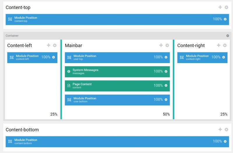
Nested Sections Yaml
I have only included the section shown above. Dont forget the indentations are done by spaces and not tabs
  /content-top/:
    -
      - position-position-6933
  /container-main/:
    -
      -
        'content-left 25':
          -
            - position-position-4734
      -
        'mainbar 50':
          -
            - position-position-2880
          -
            - system-messages-7485
          -
            - system-content-1587
          -
            - position-position-8425
      -
        'content-right 25':
          -
            - position-position-3949
  /content-bottom/:
    -
      - position-position-8044
How To
Just use the format above. I am not sure how to describe the exact syntax but 2 spaces is the indentation size you can see in the example above, which works.
Override System Outlines
Gantry comes with outlines for some system pages
- Body Only
- Error
- Offline
You need to override these and configure them how you wish because they probably will not fit in with your new layout. Things will still work if you do not. Use the Gantry Admin to make these changes.
Sections are referenced
For some reason sections are referenced in the following files that are not directly part of the outline layout.
- g5_helium/gantry/presets.yaml – Preset Style values (which includes sections)
- g5_helium/gantry/theme.yaml – not sure why they are referenced here, maybe a legacy thing
I don’t think I need to alter any of these for my options above but just incase I have listed them here.
Replace the Default template with my new layout
Now I have created my new layout with my new admin configurations (optional) I want to make it the ‘Base Outline’. You do not have to do this but it probably is better if you are going to distribute the template.
NB I should just be able to copy my new theme over the top of the /default/ , but be aware that the other outlines might stop working properly?
- Then delete all other templates
- Clone the base outline and inherit
- You now have your new template with sections and you can alter the base outline and all changes will be reflected