Items filtered by date: December 2015
Login to the Rasberry Pi GUI
When you are loaded at the command prompt you want to login to the GUI.
- Type startx
The Default Username and Password are:
- user: pi
- Password: raspberry
Move a Magento Installation
To move a magento installation you cannot just move the files, you need to make changes in the database aswell as the database connection settings.
Domain Configuration
Search for these in the database, Table core_config_data has rows and change them:
web/unsecure/base_url       http://[you_domain_here]/
web/secure/base_url         https://[your_secure_domain_here]/
Then clear the cache by deleting the files in the following directories
/var/cache
/var/session
Database Settings
The database config settings of magento are stored in the file below. I cannot remember if you need to change anything elese here other that the database connection settings.
/app/etc/local.xml
Do not leave old XML files in this directory (ie rename old-local.xml) because magento will try and parse these files aswell.
.htaccess
Dont forget to change any domain specific rules such as a canonical redirects.
Browser
- Clear your browser cache
- restart your browser
Links
3 Red Circles
These animated icons can be used for almost anything and are very easy to change. They can add something different to your page.
Design.
We design and build responsive, functional web solutions for clients all across the UK. Working closely with you to ensure that you get the best possible product.
Develop.
We believe in maintaining our design and code standards. We do not cut corners. The result is fantastic bespoke websites completely tailored to your business.
Support.
Our support team are ready to help with any queries you may have. From email support, queries regarding your website to sales and upgrades.
CSS
/* Red Circle's Animation and styling Code */
.service-circle, .service-box, .service-icon {
	margin:auto;
	-webkit-transition-timing-function: cubic-bezier(0.13, 0.71, 0.30, 0.94);
	-moz-transition-timing-function: cubic-bezier(0.13, 0.71, 0.30, 0.94);
	-o-transition-timing-function: cubic-bezier(0.13, 0.71, 0.30, 0.94);
	transition-timing-function: cubic-bezier(0.13, 0.71, 0.30, 0.94);
	-webkit-transition-duration: 0.5s;
	-moz-transition-duration: 0.5s;
	-o-transition-duration: 0.5s;
	transition-duration: 0.5s;
}

.service-circle{
	position: relative;
	display: block;
	width: 125px;
	height: 125px;
	text-align: center;
	border-radius: 108px;
	margin-bottom: 30px;
	overflow: hidden;
}

.service-circle {
	-webkit-box-shadow: inset #B02B2C 0 0 0 3px;
	-moz-box-shadow: inset #b02b2c 0 0 0 3px;
	box-shadow: inset #B02B2C 0 0 0 3px;
}

.service-circle .fa {
	display: block;
	position: absolute;
	top: 0;
	left: 0;
	width: 125px;
	height: 125px;
	font-size: 50px;
	line-height: 125px;
	color: #B02B2C;
}

.service-circle .circle {
	background: #B02B2C;
}

.service-circle .circle {
	display: block;
	position: absolute;
	top: 12px;
	left: 12px;
	width: 101px;
	height: 101px;
	border-radius: 96px;
}

.service-circle .circle {
	-webkit-transition-timing-function: cubic-bezier(0.13, 0.71, 0.30, 0.94);
	-moz-transition-timing-function: cubic-bezier(0.13, 0.71, 0.30, 0.94);
	-o-transition-timing-function: cubic-bezier(0.13, 0.71, 0.30, 0.94);
	transition-timing-function: cubic-bezier(0.13, 0.71, 0.30, 0.94);
	-webkit-transition-duration: 0.5s;
	-moz-transition-duration: 0.5s;
	-o-transition-duration: 0.5s;
	transition-duration: 0.5s;
	-webkit-transform: scale(0);
	-moz-transform: scale(0);
	-o-transform: scale(0);
	-ms-transform: scale(0);
	transform: scale(0);
}

.service:hover .service-circle {
	-webkit-box-shadow: inset #B02B2C 0 0 0 10px;
	-moz-box-shadow: inset #b02b2c 0 0 0 10px;
	box-shadow: inset #B02B2C 0 0 0 10px;
}

.service:hover .service-circle .circle {
	-webkit-transform: scale(1);
	-moz-transform: scale(1);
	-o-transform: scale(1);
	-ms-transform: scale(1);
	transform: scale(1);
}

.service:hover .service-circle .fa {
	color: #FFF;
}

.service-circle .fa {
	-webkit-transition-timing-function: cubic-bezier(0.13, 0.71, 0.30, 0.94);
	-moz-transition-timing-function: cubic-bezier(0.13, 0.71, 0.30, 0.94);
	-o-transition-timing-function: cubic-bezier(0.13, 0.71, 0.30, 0.94);
	transition-timing-function: cubic-bezier(0.13, 0.71, 0.30, 0.94);
	-webkit-transition-duration: 0.5s;
	-moz-transition-duration: 0.5s;
	-o-transition-duration: 0.5s;
	transition-duration: 0.5s;
}

.service-circle, .service-box, .service-icon {
	-webkit-transition-timing-function: cubic-bezier(0.13, 0.71, 0.30, 0.94);
	-moz-transition-timing-function: cubic-bezier(0.13, 0.71, 0.30, 0.94);
	-o-transition-timing-function: cubic-bezier(0.13, 0.71, 0.30, 0.94);
	transition-timing-function: cubic-bezier(0.13, 0.71, 0.30, 0.94);
	-webkit-transition-duration: 0.5s;
	-moz-transition-duration: 0.5s;
	-o-transition-duration: 0.5s;
	transition-duration: 0.5s;
}
HTML
<div>

	<div class="service" style="float: left; width: 30%; min-width: 180px; margin: 5px;">
		<div class="service-circle">
			<div class="circle"></div>
			<i class="link-icon fa fa-car"></i>
		</div>
		<h2>Design.</h2>
		<p>
		We design and build responsive, functional web solutions for clients all across the UK. Working closely with you to ensure that you get the best possible product.
		</p>
	</div>

	<div class="service" style="float: left; width: 30%; min-width: 180px; margin: 5px;">
		<div class="service-circle">
			<div class="circle"></div>
			<span class="link-icon fa fa-phone"></span>
		</div>
		<h2>Develop.</h2>
		<p>
		We believe in maintaining our design and code standards. We do not cut corners. The result is fantastic bespoke websites completely tailored to your business.
		</p>
	</div>

	<div class="service" style="float: left; width: 30%; min-width: 180px; margin: 5px;">
		<div class="service-circle">
			<div class="circle"></div>
			<i class="link-icon fa fa-user"></i>
		</div>
		<h2>Support.</h2>
		<p>
		Our support team are ready to help with any queries you may have. From email support, queries regarding your website to sales and upgrades.
		</p>
	</div>

</div>
Changes
Make Circles Larger
/* Make Circles Larger */
.service-circle{
    width: 216px;
    height: 216px;
}

.service-circle .fa {
    width: 216px;
    height: 216px;
    font-size: 100px;
    line-height: 216px;
}

.service-circle .circle {
    width: 192px;
    height: 192px;
}
Change Colour
/* Change Colour */
.service-circle {
    -webkit-box-shadow: inset #B02B2C 0 0 0 3px;
    -moz-box-shadow: inset #b02b2c 0 0 0 3px;
    box-shadow: inset #B02B2C 0 0 0 3px;
}

.service-circle .fa {
    color: #B02B2C;
}

.service-circle .circle {
    background: #B02B2C;
}

.service:hover .service-circle {
    -webkit-box-shadow: inset #B02B2C 0 0 0 10px;
    -moz-box-shadow: inset #b02b2c 0 0 0 10px;
    box-shadow: inset #B02B2C 0 0 0 10px;
}
Notes
- Depending on you implementation of Font Awesome your code for the icon can be slightly different. You might need to play around with the syntax.
Original code from www.web-easy-sites.co.uk
<i class="fa icon-line-speech-bubble"></i>

JSN Time
<i class="link-icon fa fa-car"></i>

NS Font Awesome
<i class="fa fa-bar-chart-o fa-4"></i>
** the fa-4 is a preset size and does not need to be used
- You can probably use other vector icons instead.
Image Frames and Styling
This is a collection of Image Frames and various styles that I come across. You can also use these to style modules by simply adding the relevant code and class.
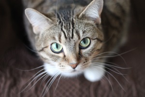
Simple Rounded Images
These images are created by simply using border-radius. 50% and seem to be the max you can apply, after this nothing happens.
200px x 200px border-radius: 50%

HTML
<img src="/images/kb/2015/621/cat-whiskers-kitty-tabby-200x200.jpg" alt="cat whiskers kitty tabby 200x200" style="border-radius: 50%;" />
This is a square image (200px x 200px) that has rounded corners and with this particular setting the image is a perfect circle.
200px x 200px border-radius: 20%
HTML
<img src="/images/kb/2015/621/cat-whiskers-kitty-tabby-200x200.jpg" alt="cat whiskers kitty tabby 200x200" style="border-radius: 20%;" />
This is a square image (200px x 200px) that has rounded corners.
200px x 300px border-radius: 50%
HTML
<img src="/images/kb/2015/621/cat-whiskers-kitty-tabby-300x200.jpg" alt="cat whiskers kitty tabby 300x200" style="border-radius: 50%;" />
This is a rectangle image (300px x 200px) and as you can see the shape is now an oval.
200px x 300px border-radius: 20%
HTML
<img src="/images/kb/2015/621/cat-whiskers-kitty-tabby-300x200.jpg" alt="cat whiskers kitty tabby 300x200" style="border-radius: 50%;" />
This is a rectangle image (300px x 200px) and as you can see the shape is still a rectangle but has rounded corners.
.frame-1 - Grey Border and 3D Shadow
CSS
/* Grey Border and 3D Shadow */
.frame-1 {
    -moz-transition: all 300ms ease-out 0s;
    -moz-border-bottom-colors: none;
    -moz-border-image: none;
    -moz-border-left-colors: none;
    -moz-border-right-colors: none;
    -moz-border-top-colors: none;
    background: -moz-linear-gradient(center top , #FAFAFA, #DDDDDD) repeat scroll 0 0 transparent;
    background: -webkit-gradient(linear, left top, left bottom, color-stop(0%,#FFFFFF), color-stop(99%,#E7E8EB)); /* Chrome,Safari4+ */
    background: -webkit-linear-gradient(top, #FFFFFF 0%,#E7E8EB 99%); /* Chrome10+,Safari5.1+ */
    background: -o-linear-gradient(top, #FFFFFF 0%,#E7E8EB 99%); /* Opera11.10+ */
    background: -ms-linear-gradient(top, #FFFFFF 0%,#E7E8EB 99%); /* IE10+ */
    filter: progid:DXImageTransform.Microsoft.gradient( startColorstr='#FFFFFF', endColorstr='#E7E8EB',GradientType=0 ); /* IE6-9 */
    border-color: #C9CBCD;
    border-radius: 0px;
    border-style: solid;
    border-width: 1px 1px 2px;
    -webkit-box-shadow: 0 8px 6px -6px black;
    -moz-box-shadow: 0 8px 6px -6px black;
    box-shadow: 0 8px 6px -6px black;
    display: inline-block;
    outline: medium none;
    padding: 4px;
}
.frame-1a - Double Grey Border and 3D Shadow
CSS
/* Double Grey Border and 3D Shadow */
.frame-1a {
    -moz-border-bottom-colors: none;
    -moz-border-left-colors: none;
    -moz-border-right-colors: none;
    -moz-border-top-colors: none;
    background: transparent -moz-linear-gradient(center top , #fafafa, #dddddd) repeat scroll 0 0;
    border-color: #c9cbcd;
    border-image: none;
    border-radius: 0;
    border-style: solid;
    border-width: 1px 1px 2px;
    box-shadow: 0 8px 6px -6px black;
    display: inline-block;
    outline: medium none;
    padding: 4px;
    transition: all 300ms ease-out 0s;
}
This is a simple grey image frame with a bit of a 3D effect
Double .frame-1a - Polaroid Style
A nice polaroid style, great for modules
HTML
<p class"frame-1a">.
<img src="/images/kb/2015/621/cat-whiskers-kitty-tabby-300x200.jpg" alt="cat whiskers kitty tabby 300x200" class="frame-1a" />
<br /> A nice polaroid style, great for modules</p>
<p>This is a nice effect of layering the image frames for a module or image.</p>
This is a nice effect of layering the image frames for a module or image. As you can see in the code the image and it's parent container has the .frame-1a class applied. This can be translated easily into a module by putting the class in to the modules class suffix and either a manully created container in the module or on an image. You can also mix and match other template classes with the method to see what you get.
.frame-2 - Black Border and 3D Shadow
CSS
/* Black Border and 3D Shadow */
.frame-2 {
    -moz-border-bottom-colors: none;
    -moz-border-image: none;
    -moz-border-left-colors: none;
    -moz-border-right-colors: none;
    -moz-border-top-colors: none;
    background: -moz-linear-gradient(center top , #201b1a, #141111) repeat scroll 0 0 transparent;
    background: -webkit-gradient(linear, left top, left bottom, color-stop(0%,#666), color-stop(99%,#444)); /* Chrome,Safari4+ */
    background: -webkit-linear-gradient(top, #666 0%,#444 99%); /* Chrome10+,Safari5.1+ */
    background: -o-linear-gradient(top, #666 0%,#444 99%); /* Opera11.10+ */
    background: -ms-linear-gradient(top, #666 0%,#444 99%); /* IE10+ */
    filter: progid:DXImageTransform.Microsoft.gradient( startColorstr='#666', endColorstr='#444',GradientType=0 ); /* IE6-9 */
    border-color: #555;
    border-radius: 0px;
    border-style: solid;
    border-width: 1px 1px 2px;
    -webkit-box-shadow: 0 8px 6px -6px black;
    -moz-box-shadow: 0 8px 6px -6px black;
    box-shadow: 0 8px 6px -6px black;
    display: inline-block;
    outline: medium none;
    padding: 4px;
}
.circle-1 - Round Images with Double Grey Border (with horizontally stretch if needed)
CSS
/* Round Images with Double Grey Border (with horizontally stretch if needed) */
.circle-1 {
    -moz-transition: all 300ms ease-out 0s;
    -moz-border-bottom-colors: none;
    -moz-border-image: none;
    -moz-border-left-colors: none;
    -moz-border-right-colors: none;
    -moz-border-top-colors: none;
    background: -moz-linear-gradient(center top , #FFFFFF, #E7E8EB) repeat scroll 0 0 transparent;
    background: -webkit-gradient(linear, left top, left bottom, color-stop(0%,#FFFFFF), color-stop(99%,#E7E8EB)); /* Chrome,Safari4+ */
    background: -webkit-linear-gradient(top, #FFFFFF 0%,#E7E8EB 99%); /* Chrome10+,Safari5.1+ */
    background: -o-linear-gradient(top, #FFFFFF 0%,#E7E8EB 99%); /* Opera11.10+ */
    background: -ms-linear-gradient(top, #FFFFFF 0%,#E7E8EB 99%); /* IE10+ */
    filter: progid:DXImageTransform.Microsoft.gradient( startColorstr='#FFFFFF', endColorstr='#E7E8EB',GradientType=0 ); /* IE6-9 */
    border-color: #C9CBCD;
    border-radius: 800px;
    border-style: solid;
    border-width: 1px 1px 2px;
    display: inline-block;
    outline: medium none;
    padding: 8px;
}
.circle-1a - Round Images with Double Grey Border (with horizontally stretch if needed)
CSS
/* Round Images with Double Grey Border (with horizontally stretch if needed) */
.circle-1a {
    -moz-border-bottom-colors: none;
    -moz-border-left-colors: none;
    -moz-border-right-colors: none;
    -moz-border-top-colors: none;
    background: transparent -moz-linear-gradient(center top , #ffffff, #e7e8eb) repeat scroll 0 0;
    border-color: #c9cbcd;
    border-image: none;
    border-radius: 800px;
    border-style: solid;
    border-width: 1px 1px 2px;
    display: inline-block;
    outline: medium none;
    padding: 8px;
    transition: all 300ms ease-out 0s;
}
There might be no difference between .circle-1 and circle-1a .
Simple Image Gallery Polaroid Code
I have put this here for when I do my own Polaroid Frame Article, either here or possible a separate article.
CSS
/**
 * @version		3.0.x
 * @package		Simple Image Gallery Pro
 * @author		JoomlaWorks - http://www.joomlaworks.net
 * @copyright	Copyright (c) 2006 - 2014 JoomlaWorks Ltd. All rights reserved.
 * @license		http://www.joomlaworks.net/license
 */

/* --- Generic Styling --- */
a:active,a:focus { outline:0; }
table.contentpaneopen { width:100%; }
li.sigProClear { clear:both; float:none!important; height:0!important; line-height:0!important; border:none!important; background:none!important; width:auto; margin:0!important; padding:0!important; }

/* Container */
ul.sigProPolaroids { margin:20px!important; padding:40px 60px!important; list-style:none; clear:both; overflow:hidden; }
	ul.sigProPolaroids.singleThumbGallery { margin:0!important; padding:8px 36px 8px 16px!important; list-style:none!important; float:left; }

/* Thumbnail: use e.g. width:33%; to force 3 columns */
ul.sigProPolaroids li.sigProThumb { display:block; float:left; background:#fff!important; list-style:none!important; margin:20px 0 27px 30px; padding:10px; text-align:center; text-decoration:none; color:#333; font-family:'Indie Flower', cursive; font-size:18px;
    -moz-box-shadow: 0px 3px 6px rgba(0,0,0,.25);
 -webkit-box-shadow: 0px 3px 6px rgba(0,0,0,.25);
         box-shadow: 0px 3px 6px rgba(0,0,0,.25);

    -moz-transition: 0 0.15s linear;
      -o-transition: 0 0.15s linear;
 -webkit-transition: 0 0.15s linear;
     -ms-transition: 0 0.15s linear;
         transition: 0 0.15s linear;

		 -moz-transform: rotate(-2deg);
       -o-transform: rotate(-2deg);
  -webkit-transform: rotate(-2deg);
      -ms-transform: rotate(-2deg);
          transform: rotate(-2deg);
             filter: progid:DXImageTransform.Microsoft.Matrix(M11=0.9993908270190958, M12=0.03489949670250097, M21=-0.03489949670250097, M22=0.9993908270190958, sizingMethod='auto expand');
               zoom: 1;
}
ul.sigProPolaroids li.sigProThumb:nth-child(even) {
     -moz-transform: rotate(2deg);
       -o-transform: rotate(2deg);
  -webkit-transform: rotate(2deg);
      -ms-transform: rotate(2deg);
          transform: rotate(2deg);
             filter: progid:DXImageTransform.Microsoft.Matrix(M11=0.9993908270190958, M12=-0.03489949670250097, M21=0.03489949670250097, M22=0.9993908270190958, sizingMethod='auto expand');
               zoom: 1;

}
ul.sigProPolaroids li.sigProThumb:nth-child(3n) { position:relative; top:-5px;
     -moz-transform: rotate(0deg);
       -o-transform: rotate(0deg);
  -webkit-transform: rotate(0deg);
      -ms-transform: rotate(0deg);
          transform: rotate(0deg);
             filter: progid:DXImageTransform.Microsoft.Matrix(M11=1, M12=0, M21=0, M22=1, sizingMethod='auto expand');
               zoom: 1;
}
ul.sigProPolaroids li.sigProThumb:nth-child(5n) { position:relative; right:5px;
     -moz-transform: rotate(5deg);
       -o-transform: rotate(5deg);
  -webkit-transform: rotate(5deg);
      -ms-transform: rotate(5deg);
          transform: rotate(5deg);
             filter: progid:DXImageTransform.Microsoft.Matrix(M11=0.9961946980917455, M12=-0.08715574274765817, M21=0.08715574274765817, M22=0.9961946980917455, sizingMethod='auto expand');
               zoom: 1;
}
ul.sigProPolaroids li.sigProThumb:nth-child(8n) { position:relative; right:5px; top:8px; }
ul.sigProPolaroids li.sigProThumb:nth-child(11n) { position:relative; left:-5px; top:3px; }

ul.sigProPolaroids li.sigProThumb:hover { position:relative;
 -webkit-transform:scale(1.2);
    -moz-transform:scale(1.2);
      -o-transform:scale(1.2);

   -moz-box-shadow: 0px 3px 6px rgba(0,0,0,.5);
-webkit-box-shadow: 0px 3px 6px rgba(0,0,0,.5);
        box-shadow: 0px 3px 6px rgba(0,0,0,.5);
}

ul.sigProPolaroids li.sigProThumb a.sigProLink { color:#333; text-decoration:none; overflow:hidden; }
ul.sigProPolaroids li.sigProThumb a.sigProLink img.sigProImg { display:block; width:100%; margin-bottom:8px; background-repeat:no-repeat; background-position:50% 50%;}

/* Caption */
ul.sigProPolaroids span.sigProPseudoCaption,ul.sigProPolaroids span.sigProCaption { display:block; text-align:center; font-family:'Indie Flower', cursive; font-size:22px; font-weight:bold; }

/* Popup */
span.sigProPopupCaption { font-weight:bold; color:#C63C13; font-size:13px; font-family:Georgia, "Times New Roman", Times, serif; }
a.sigProDownloadLink,
a.sigProDownloadLink:hover { background:url(../images/disk.png) no-repeat left center; padding:4px 0 4px 20px; }
div.sigProModulePosition { text-align:center; border-top:1px solid #ccc; border-bottom:1px solid #ccc; padding:4px; margin:8px 0; background:#ffffdd; }

/* IE specific styling: Use "body.sigProIsIEX element {}" - where X is 6, 7 or 8 - to target elements for these browser versions only */
body.sigProIsIE6 ul.sigProPolaroids li.sigProThumb,
body.sigProIsIE7 ul.sigProPolaroids li.sigProThumb,
body.sigProIsIE8 ul.sigProPolaroids li.sigProThumb {border:1px solid #ccc;border-right:2px solid #ccc;border-bottom:2px solid #ccc;}
body.sigProIsIE6 ul.sigProPolaroids li.sigProThumb span.sigProCaption,
body.sigProIsIE7 ul.sigProPolaroids li.sigProThumb span.sigProCaption,
body.sigProIsIE8 ul.sigProPolaroids li.sigProThumb span.sigProCaption {}
body.sigProIsIE7 ul.sigProPolaroids li.sigProThumb {float:none;display:inline;}
body.sigProIsIE6 ul.sigProPolaroids li.sigProThumb a.sigProLink:hover,
body.sigProIsIE7 ul.sigProPolaroids li.sigProThumb a.sigProLink:hover,
body.sigProIsIE8 ul.sigProPolaroids li.sigProThumb a.sigProLink:hover {color:#125BAE;}
body.sigProIsIE6 ul.sigProPolaroids li.sigProThumb a.sigProLink img.sigProImg,
body.sigProIsIE7 ul.sigProPolaroids li.sigProThumb a.sigProLink img.sigProImg {width:auto;}

/* Flickr Set link */
a.sigProFlickrSetLink {display:block;clear:left;padding:2px 8px;font-size:10px;text-align:center;}

/* Print message */
.sigProPrintMessage {display:none;}
JSN-UniForm
Positioning
/* Uniform - set max width and center*/
.jsn-uniform {max-width: 450px; margin: auto auto;}
/* Uniform - centers the secureimage block within the uniform column */
.jsn-uniform .controls{text-align: center;}
/* Uniform - securimage going outside the container */
.form-horizontal .controls {margin-left: 0px !important;}
/* Correct position of the capture */
.jsn-uniform .controls img {
    margin-bottom: 20px;
    padding-right: 20px;
}
Other
Disable Pence Field
/* Uniform - Disable Pence on form */
.jsn-master .jsn-bootstrap .currency-cents .controls-inner input,
.jsn-master .jsn-bootstrap .jsn-narrow .control-group .currency-cents {
	display:none;
}
/* Disable the '.' and Pence on contact form - normal */
.jsn-master .jsn-bootstrap .currency-cents .controls-inner input,
.jsn-master .jsn-bootstrap .jsn-narrow .control-group .currency-cents,
.jsn-master .jsn-bootstrap .jsn-narrow .control-group .currency-cents::before {
	display:none;
}
/* Disable the '.' and Pence in modals - possibly normal forms aswell */
.jsn-master .jsn-bootstrap .currency-cents,
.jsn-master .jsn-bootstrap .currency-cents::before {
    display:none !important;
}
When disabling fields or other elements on a Uniform when it is in a modal, you need to add the CSS rule into CSS field in the admin section of that form so it is placed inline. The !important statement seems mandatory aswell. This code might work for normal Uniforms but note that it is not form specific.
Styling
/* Uniform - Form Labels */
#jsn_form_1.jsn-master .jsn-bootstrap .jsn-form-content .control-group .control-label,
#jsn_form_2.jsn-master .jsn-bootstrap .jsn-form-content .control-group .control-label
{
	font-family:Arial;
	font-size:18px;
	font-weight:normal;
	color:#ff972f;
}
/* Uniform - Button Styling */
button.jsn-form-submit {
	height: 49px;
	width: 187px;
	background: url(../../../images/pages/contact-us/Submit-Button.jpg);
}
/* line 9 - bootstrap-min.css) */
button.jsn-form-submit:hover, button.jsn-form-submit:focus {
  background-position: 0px 0px;
}
/* CSS Button Styling */
#jsn-master .btn.btn-primary.jsn-form-submit {
    background: transparent;
    color: #464646;
    border: 1px solid #777;
    text-transform: uppercase;
    text-shadow: none;
    padding: 10px 30px;
    border-radius: 2px;
    -moz-border-radius: 2px;
    -webkit-border-radius: 2px;
}
In the following templates custom.css has a fully styled contact form
- joomlashine time
- mini
Other
cannot disable the uniform editor button
- Plugin Manager -> Search Uniform -> Disable JSN UniForm - Button Form - Doesnt work because it is a protected button
- I disabled the button by editing the phpmyadmin entry for this extension and changed the field 'protected' from 1 to 0 for the uniform button this worked
- ideal resolutions of images
- 1920 x 600
- 960 x 400
Complete Example
This is a more complete example of where I use many fot he snippets above to fix JSN-Uniform in JSN-Blank (for lamb ino)
/*-- Uniform --*/

/* Desktop */
.jsn-master .jsn-input-xlarge-fluid {
    width: 50% !important;
}

/*input#jsn-captcha {
 	width: 50% !important;
    max-width: 215px;
}*/

/* Uniform - securimage going outside the container */
.form-horizontal .controls {margin-left: 0px !important;}


button.btn.btn-primary.jsn-form-submit {
    float: left;
    margin-left: 180px !important;
}

/* Tablet mode break point */
@media only all and (min-width: 30.062rem) and (max-width: 47.938rem) {
    .jsn-master .jsn-input-medium-fluid,
    .jsn-master .jsn-input-xlarge-fluid {
        width: 95% !important;
    }

    .form-horizontal .controls {
        margin-left: 0px;
    }

    button.btn.btn-primary.jsn-form-submit {
        float: left;
        margin-left: 0 !important;
    }
}

/* Mobile Single Column */
@media only screen and (max-width: 480px), (max-device-width: 480px) {
    .jsn-uniform #jsn-captcha {
        width: 215px !important;
    }
}

@media only all and (max-width: 30rem) {
    .jsn-master .jsn-input-xlarge-fluid {
        width: 95% !important;
    }

    button.btn.btn-primary.jsn-form-submit {
        margin-left: 0 !important;
    }
}

/*-- --*/
Menu
Menu
/* Make Menu all gold */
#jsn-menu {
	color: #13548E;
	background-color: #D1B87E;
}
/* make unselected links blue */
div.jsn-modulecontainer ul.menu-mainmenu li > a {
    color: #13548E;
}
/* remove <li> border */
div.jsn-modulecontainer ul.menu-mainmenu > li, div.jsn-modulecontainer ul.menu-mainmenu > li > a {
    border-right: none;
}
/* removes black line below menu */
#jsn-content-top {
    padding-top: 3px;
}
/* blue links for menu module */
div.jsn-modulecontainer ul.menu-sidemenu > li > a {
    color: #13548E;
	font-weight: bold;
}
/* Main Menu - make menu items smaller */
div.jsn-modulecontainer ul.menu-mainmenu > li > a {
	padding: 10px 20px;
}
/* Main Menu - Font Size */
div.jsn-modulecontainer ul.menu-mainmenu > li > a {
    font-size: 14px;
}
This is sometimes set in the template.css for some reason
/* Menu Items red - but keep active white */
body #jsn-menu ul.menu-mainmenu a {
	color: #8E2E42;
}
body #jsn-menu ul.menu-mainmenu > li.active > a {
    color: #fff;
}
/* reducemenu item width */
div.jsn-modulecontainer ul.menu-mainmenu > li > a {
    padding: 4px 10px;
}
/* Make Main Menu Grey */
#jsn-menu {
    background-color: #EFEFEF;  /*#EFEFEF  this is very common*/
    box-shadow: none;
}
/* Main Menu - change font size and color - untested */
div.jsn-modulecontainer ul.menu-mainmenu > li > a span.jsn-menutitle {
	font-size: 12px;
	color: #ADADAD;
}
/* Main Menu - change font weight - untested */
#jsn-menu ul.menu-mainmenu > li > a span.jsn-menutitle {
	font-weight: 700;
}
/* add border to the top of menu */
#jsn-menu {
    border-top: 1px solid #dcdcdc;
}
/* Make menu deeper */
div.jsn-modulecontainer ul.menu-mainmenu > li {
	padding: 40px 0;
}
/* make sticky menu deeper */
#jsn-header.jsn-menu-sticky ul.menu-mainmenu > li {
	padding: 40px 0px;
}
/** Footer menu fix **/

/* Remove Cross */
.jsn-menu-mobile-control{display: none !important;}

/* remove Line Separators */
ul.menu-divmenu li {border-right: 1px none;}
Worked Menu Example
This creates a Black Menu, White Font and the sub-menu items have a grey background.
/* Makes Black Background and white font */
#jsn-content, #jsn-maincontent, #jsn-page, #jsn-header, #jsn-footer {
	background-color: black;
	color: white;
}

/* make menu font gold */
#jsn-menu a > span  {
	font-family: "LTKaliberItalic", Times, serif;
	color: #B78B1A;
	font-size:150%;
}

/* mobile menu gold */
#jsn-menu .jsn-modulecontent > .jsn-menu-toggle, #jsn-menu .jsn-modulecontainer[class*="display-"] .jsn-modulecontainer_inner h3.jsn-moduletitle {
	font-family: "LTKaliberItalic", Times, serif;
	color: #B78B1A;
	font-size:150%;
}


/* mainmenu make sub levels have grey background */
/* ----- 1st LEVEL ----- */
div.jsn-modulecontainer ul.menu-mainmenu ul {
	background-color: #333333;
}
/* ----- HOVER STATE ----- */
div.jsn-modulecontainer ul.menu-mainmenu ul li:hover > a,
div.jsn-modulecontainer ul.menu-mainmenu ul li.active > a {
	background-color: #333333;
	/*color: #627989;*/
}
/* ----- ACTIVE STATE ----- */
div.jsn-modulecontainer ul.menu-mainmenu li.active > a {
	color: #627989;
}
Stock Samsung S2 to Cyanogenmod
These are my verified instructions on how to take a Samsung S2 stock ROM phone that is not rooted to a fully rooted phone with cyanogenmod rom installed.
Prerequisites
- Samsung S2 International Phone
- Odin 1.85 (later version should work)
- The Samsung drivers installed (these are part of kies or use the standalone installer)
- cm-10.1.3-i9100.zip ROM
- cm-11-20141230-NIGHTLY-i9100.zip
- Slim_mini_gapps.4.4.4.build.8.x-385.zip(optional)
- Siyah-s2-v6.0b5.tar Kernel
Instructions
- Put your phone into download/ODIN mode by powering on with the following combination volume down+home+power
- Press volume up to continue
- Plug your phone in by usb cable to your PC
- Install and open ODIN
- Verify that your phone is recognised, you should see an ‘added Message’. If you do not it is likely that your drivers are not installed or are incorrect. You can check this in device manager. The driver should be referenced as ‘SAMSUNG Mobile USB Device’. If the phone is recognised as unknown manual select the correct driver and if ‘SAMSUNG Mobile USB Device’ is not present, install the drivers and recheck
- Once you have your phone detected, click on PDA
- Select Siyah-s2-v6.0b5.tar
- Click start
- When this is done, a successful message will appear
- Disconnect your USB cable
- Power off the phone
- boot into CWM recovery mode power+up+home button
- install the cm-10.1.3-i9100.zip – we need to install this so that we have a compatible kernel to upgrade to Cyanogen 11
- wipe data/factory restore
- wipe cache
- power off – we need to do this so we can load the new version of clockwork mod that has just been installed
- boot into CWM recovery mode power+up+home button.
- Install cm-11-20141230-NIGHTLY-i9100.zip (if you get a context error, boot the phone and see if 11 is present, if so install the v11 rom again to make sure it is clean)
- Boot android
- run the cyanogen updater and put the latest version on
- power off
- boot into CWM recovery mode power+up+home button
- install Slim_mini_gapps.4.4.4.build.8.x-385.zip – so you have the normal android apps
Useful links
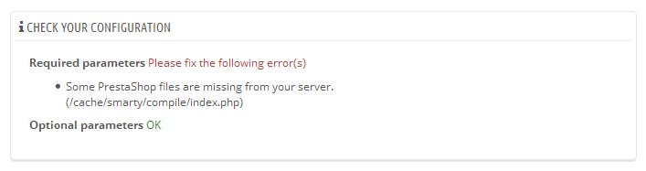
Cannot install a theme in Prestashop
When trying to install a theme from any of the 3 methods in the theme is not installed and you receive an error:
- Import from your computer

- Import from the web

- Import from FTP - (Install from theme directory)

Cause
Files and folders are missing from the cache folder. This is most likely caused by people deleting all the files and folders in the cache folder because they think this is how to empty the cache and that everything in this folder can be deleted.
You will most likely see an error in (Advanced Parameters --> Configuration information) showing that there are files missing in the cache.
Solution
Follow the following steps to reconstruct the cache file and folder structure of Prestashop:
- Download a fresh copy of Prestashop with the same version number as your shop
- Extract all of the files and folders in the cache folder from the zip into the cache folder of your shop
Links
Import eml files into Outlook Express
One of the easiest ways of importing emails in to Outlook Express is to use .eml files , this also makes it an import channel from virtually all email programs be cause .eml is a standard file format. However unless you know how to import .eml intoOutlook Express this becoms very difficult because the method is not obvious.
Solution
To import converted EML files to another machine having Outlook Express follow the following steps:
- Copy all your converted EML files and move them to another machine having Outlook Express through Pen Drives or CD.
- Open the folder where you have kept all your eml files.
- Open Outlook Express ( Go to Start -> Programs -> Outlook Express)
- Select all the eml files.
- Then finally Drag & Drop all you eml in Outlook Express.
Outlook 2013 wants to delete .ost file when removing pop3 account
I wanted to remove a POP3 account in Outlook 2013 but receive the following error message
Careful, if you remove this account, its offline cached content will be deleted. Learn how to make a backup of the .ost file.
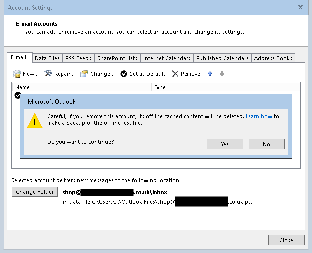
I have both an Exchange account and a standard POP3 account in my Outloook profile.
I understand a pop3 account stores information in the .pst file to which it's directed, not a .ost file. Exchange activesync stores the information in a .ost file. However I am trying to remove the pop3 account, not the exchange activesync account. So I am afraid that if I go ahead and remove, the error message is indicating that it will delete everything in the .ost file.
Answer
The only bug is that the message about the .ost file shouldn't appear when deleting an Outlook.com configured as a PST file while it's also configured as an EAS file in the same profile. Just tested this by deleting the POP version of the Outlook.com account also configured as an EAS account the same profile and everything remained intact.Even it were to delete the OST file - it would automatically get recreated when Outlook is restarted with the only data loss would be related to the folders identified with "This Computer Only" (Drafts, Notes, Journal)I can confirm that if you delete the POP3 account that neither the .PST or the .OST file are deleted. The error message should not be displayed and is definately a bug.
Links